- The theme zip file g5plus-pepper.zip (included WPBakery Page Builder and Revolution Slider plugins)
- Child theme for easier customize in g5plus-pepper-child.zip
- Document in Documentation-pepper.zip
Struct look like:

PEPPER theme is a super-customizable WordPress theme that help you to create amazing websites effortlessly and without spending the enormous amount of time. The extremely user-friendly interface, versatile design, and new features of Pepper theme make it the perfect investment for your time, efforts, and business.
PEPPER features 19+ completely different homepages, clean designed demo homepage templates for you to get started. This documentation just a glimpse of what you can achive by using the theme. And we are just getting started as our designers will continuously add more homepages and custom pages.
In this documentation, you'll find information about installing the theme, setting it up properly on your domain and customizing it as per your need; which includes setting up different pages for the site and everything from scratch. No prior knowledge of design and coding is required.
You can follow different topics listed here and follow this step-by-step guide to setup your site with Pepper. We keep updating tutorial and Knowledge Base with vital tips (Kindly note, that we cannot provide the support until you specify your envato username by which you used to purchase the theme and Item Purchase Code).
We have prepared detailed user manual in order to ensure smooth and easy work with pepper. However, If you have any question that are beyond the scope of this documentation or difficulties with our theme – we will be there for you! Please feel free to contact us via our helpdesk or email and we will get back to you as soon as possible! Thank you so much for purchasing our theme!
We also offer Install Demo Data and site installation service for a nominal price of $20. Most theme installation and setup is done within 1 working day (http://g5plus.net/customize-services/#installdemodata)

Pepper includes 6 other folders. Please see explanation below for more details:
Here, we outline all types of necessary information, and provide you with all the essential details you require for using Pepper theme. Pepper can only be used with WordPress and we presume that you already have WordPress installed and ready to go. Please ensure that you are running WordPress 3.9 or higher, PHP7.2 or higher, and MySQL 5 or higher. We have tested it with Mac, Windows and Linux. Below is a list of items you should ensure your host can comply with.
Many issues that you may run into such as: white screen, demo content fails when importing, empty page content and other similar issues are all related to low PHP configuration limits. The solution is to increase the PHP limits. You can do this on your own, or contact your web host and ask them to increase those limits to a minimum as our requires
Please consult Check System Status section to make sure your server is set up properly and the theme and content will be loaded correctly. Enough server configuration will also ensure fast speed and increase performance.
You can also consult Troubleshooting articles here for finding out a solution for your issue related to low PHP limits.
Navigate to Themeforest account and access at Downloads page in the profile. You’ll see the Download button in front of Pepper theme. After you click it, you’ll get the options to download all files in zip-archive, licenses and purchase code, or installable pack only (We would recommend you to install all files of the theme).

Please, unzip the archive on your computer. you’ll get the themeforest-17387412-pepper-wp-theme folder. All the information you may need is located in it.
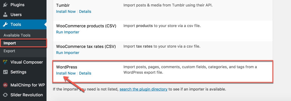
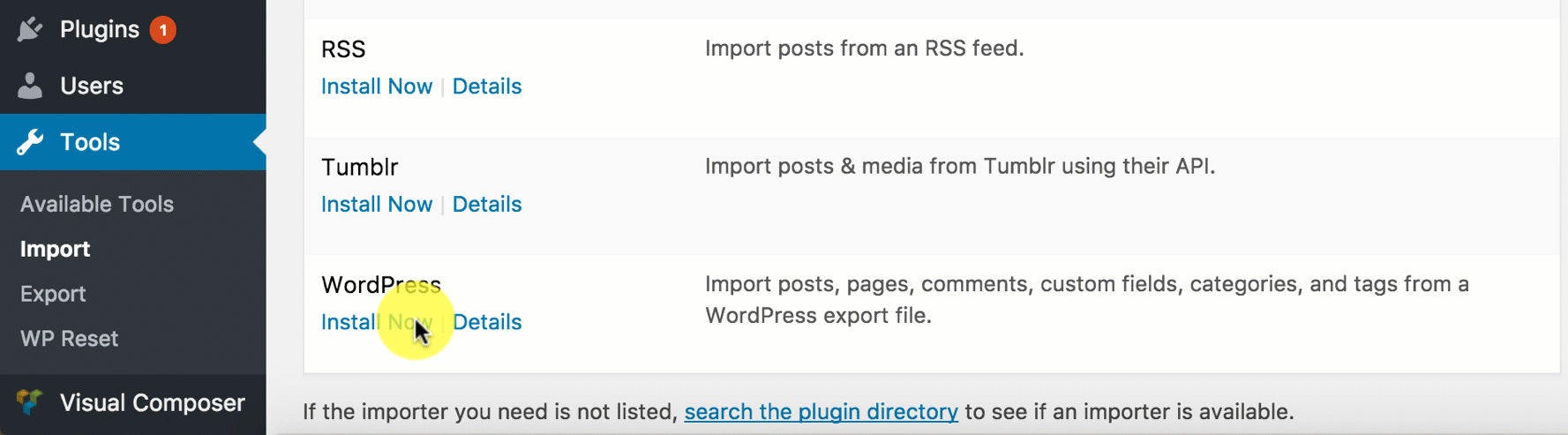
Step 1 - Login to your Wordpress Dashboard

Step 2 - Go to Appearance → Themes. Click the Add New button or Add new theme link. (check screenshot below)


Step 3 - Click on the Upload Theme button. Locate g5plus-pepper.zip and click Install Now.


Step 4 - Click on the Activate button to activate pepper.
In cases where you uploaded the files with other FTP tools, open the Wordpress dashboard and navigate to Appearance → Themes. You can Activate pepper from the theme choices there.

If you don’t like following through the above mentioned step-by-step or need more instructions, then let’s go to consult our video guide on How to install Pepper theme with all demo content via WordPress
Congratulations, you have now activated pepper! You can now proceed with Pepper's Plugin Installation.
You could consult our video guide on How to install an G5Theme item via FTP
Step 1 - Log into your Hosting server using an FTP client (like FileZilla or WinSCP).
Step 2 - Locate "g5plus-pepper.zip" that you found in your ThemeForest Package and unzip it somewhere on your hard drive. Once it is unzipped it will look like a folder named pepper with all theme files in it.
Step 3 - Locate your Wordpress installation and upload the theme directory pepper (you unzipped in the previous step) into ../wp-content/themes/ in your Wordpress installation.
Step 4 - Click on the Activate button to activate pepper. Congratulations, you have now activated pepper! You can now proceed with pepper's Plugin Installation.
A Child Theme is specifically for developers who are willing to make changes to the critical functions and codes (If you do not intend to go that far, you can ignore this chapter).
IMPORTANT : If you want to edit the templates and functions of a theme, we always advise you to incorporate or install Child Theme and make changes therein. To know more about the need and purpose of creating child theme, visit WordPress Codex on: codex.wordpress.org/Child_Themes.
In the downloaded theme package, you will see materials required for Child Theme named g5plus-pepper-child.zip archive. You can install child theme in a similar way as you install main theme.
In the child theme, almost all files from main theme can be replaced. It doesn’t concern or affect only .php-files with templates and basic logics, but also .js and .css files from respective files and folders with images, icons etc,.If you are thinking about changing some functions of the theme or adding new ones, you have to create file functions.php in the g5plus-pepper-child folder, and add all requisite functions into it. If our WordPress theme has functions with such names, they will be replaced by yours, if not – your functions will complete the logics of our theme.
If you want to replace some functions from other files (except functions.php), we highly recommend you, NOT to copy-paste respective files into the child theme, but instead create the respective functions in functions.php in the child theme. This should be strictly implemented, so that while updating them, new functions from these files are available for use.
All plugins required have been into your download package, so you only need to do is click on the "Begin installing plugins".
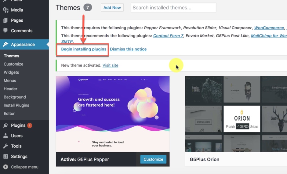
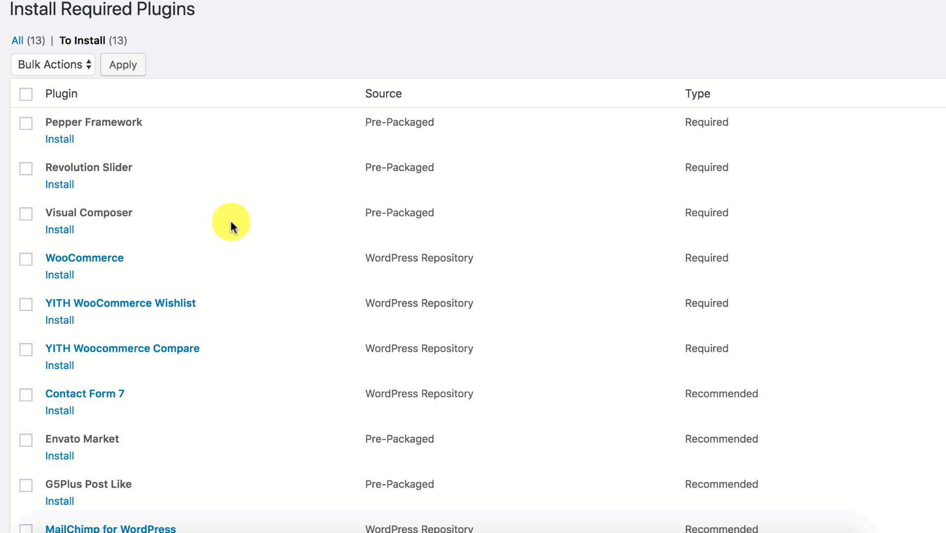
You should be navigated to the Install Required Plugin page, which shows reqquired plugins list, all you need is clicking on the checkbox beside "Plugin" label to select all plugins in the list, then choose "Install" from the drop-down list at the top and then click "Apply".
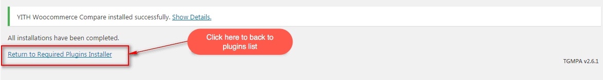
The installing process status will be shown in your browser. It may takes a few minutes, so please be patient. After sucessfull, your screen like that
When the notice "All installations have been completed" appears, click on the "Return to Required Plugins Installer" link to turn back to the plugin list.
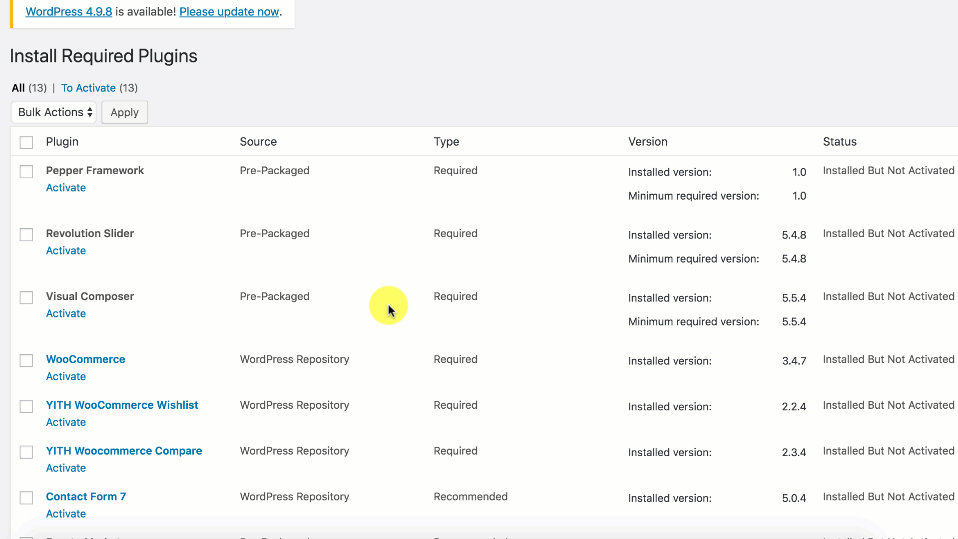
Next, click on the box beside the Plugin label again to select all plugins and choose Activate this time as image below.
WPBakery Page Builder and Slider Revolution are LICENSED to be distributed with Pepper theme (Template Library is not included with this version of WPBakery Page Builder). So you DO NOT need to PURCHASE any separate license to activate them. We'll continue to provide updated and stable version of all required plugins for the life span of Pepper theme. You DO NOT need to purchase any supporting plugin which is part of the theme bundle.

Please sign-up and log-in to our support site to download the latest version of WPBakery Page Builder and Revolution Slider plugin throught this link
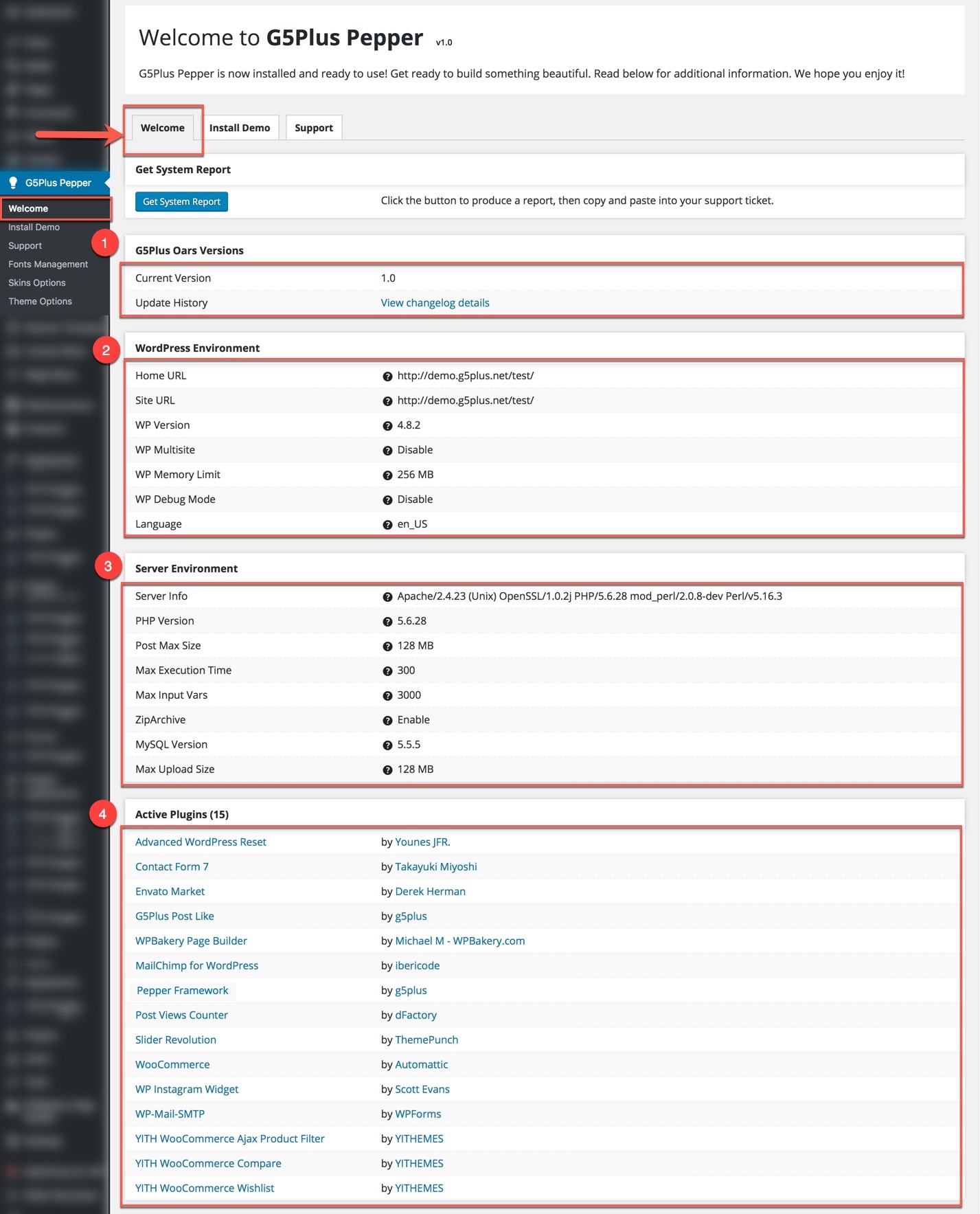
System Status help you get important information of Server and WordPress environment without having to check the system status on your server. Please check this page before contacting customer services and asking your server to change the status of the server as we recommended.
From admin dashboard, go to G5Plus Pepper → Welcome
You could please consult our guide on How to increase the PHP limits here:http://support.g5plus.net/knowledge-base/system-required
With Pepper, you can build a fully functional website just by clicking a button and install our demo data or click Manually Setup section to build your website step by step. Your Pepper installation will be set up with what we have on our demo website, and you can use it as a template to develop your own website.
Go to G5Plus Pepper → Install Demo
Then choose option button to install demo as you want:
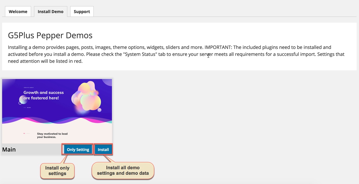
The process would be displayed on import status bars so you will know when it is finished and your data is ready.

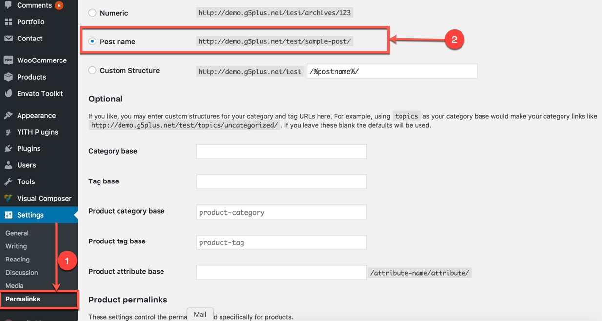
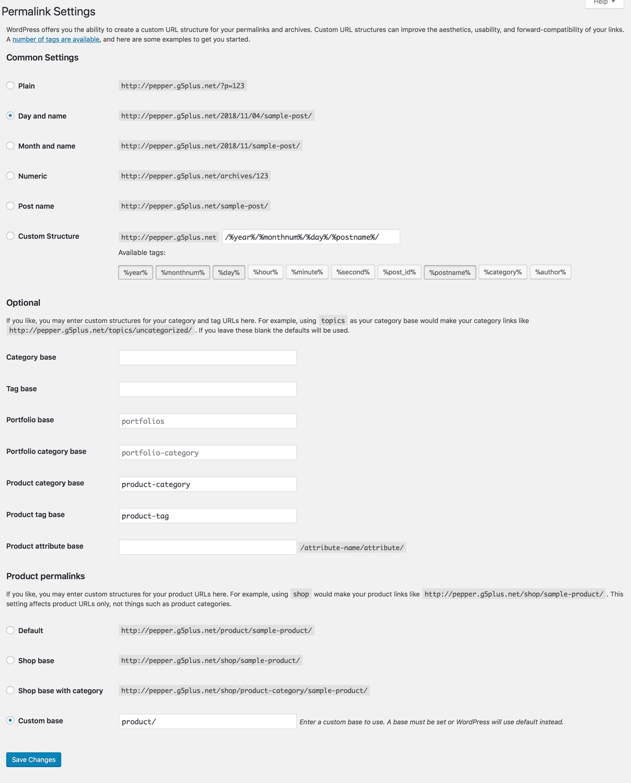
You can create a custom URL structure for your permalinks and archives. Custom URL structures can improve the aesthetics, usability, and forward-compatibility of your links. You should ensure that a non-default permalink setting is selected, e.g. Month and name in Settings → Permalinks .Then select Post name and click Save Change
DONE. Now, you can visit your website to view demo (Landing Page)
Please go through the Setup Homepage section to learn how to set Front Page and Posts page
If you are new to WordPress and have problems with setting up the theme you might want to import the demo content file that comes with the Pepper. The following actions will import some dummy posts and pages from the live preview:
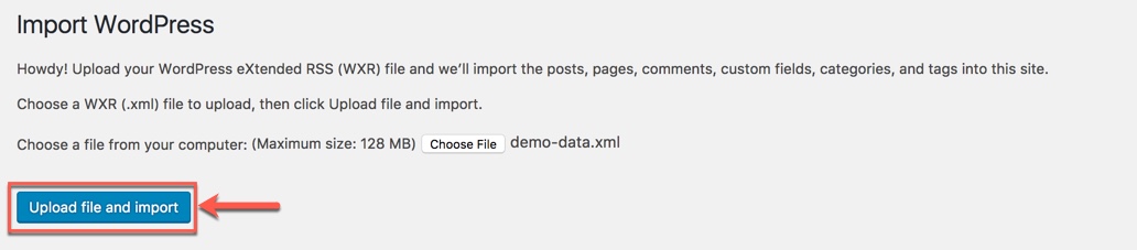
Display asked to import author, selected and continue
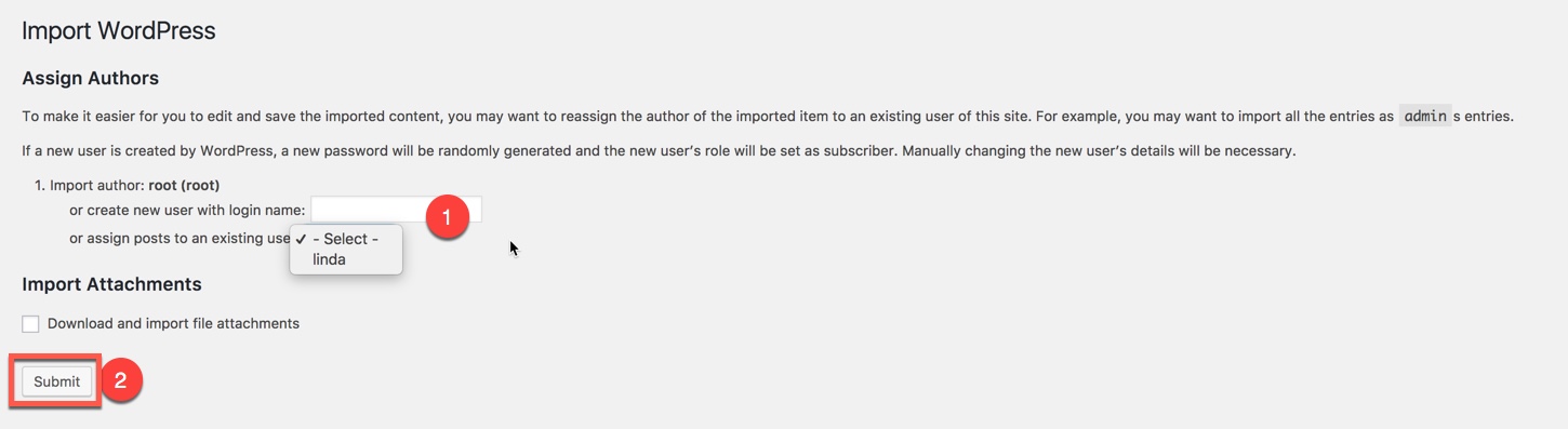
Once the importing is complete:
And that is pretty much it, shouldn't take more than a few minutes.
After completing all above steps, open frontend link (Landing Page) to see your result
If you don't want to use the demo content pack, you can read the instructions on how to work with our theme built-in Page Builder below to make your own pages.
WPBakery Page Builder is the most powerful and used WP pagebuilder and there is more than 1 million sites that are using that to create homepage. This plugin is included in Pepper theme by free to create advanced and complex homepage in simplest way ever has seen!
Now you can start fiddling with WPBakery Page Builder to build your home page with any design that you like and also you can read the WPBakery Page Builder documentation to learn how to use it HERE
Our theme includes several page templates to choose from, and you will need to choose the page template that suits your needs and create any number of pages with content. All of this is done in the pages section of your WordPress admin.
If you DID NOT One Click Install demo, you will need to MANUALLY CREATE your Home and other pages. Here’s how to build a new page:
Step 1 – Navigate to Pages in your admin sidebar and click Add New option.

Step 2 – Input a new name for your page, and click BACKEND EDITOR to build page by WPBakery Page Builder or click FRONTEND EDITOR to build page by WPBakery Page Builder on the frontend (make sure that you have installed WPBakery Page Builder plugin).

Step 3: Content for your page goes in the editing field, use the Visual or Text editor. With WPBakery Page Builder, page content is mainly built using Shortcodes, Template. See the Shortcodes and Templates section for how to use them. You can also use our demo content, see the corresponding section of this document for the demo code of each page.

Step 4 – Setup values for Page Settings which will affect to this page only and override options set in the Preset (if this page apply any Preset) or Theme Options. With each page, Page Settings is first priority, next is Preset, then is Theme Options, any change in Page Settings just affect to this page, not entire website.
General Settings:

Menu Settings:

Any option that was set to be Default or was not customized means that it will use the value of equivalence option you have set in Preset (if this page apply any Preset) or Theme Options. Insert a different value to override the Preset/ Theme Option value.
You could consult our guide on How to use Preset for more details on How to apply Preset to a Page/Post
Step 5 – Set your Parent page (It’s usually set to No Parent).
Step 6 – Set featured image for your page (optional)
Step 7 - You can save draft/preview or publish this page and set it as your frontpage. You could consult Settings a static page as Home section.
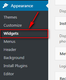
WordPress comes with built-in default widgets for your themes. Apart from these default widgets, Pepper comes with 10 custom widgets. In order to use these widgets, from WP dashboard, navigate to Appearance → Widgets.
These screenshots below are list of pre-defined sidebars as well as their locations on a page, so that you will find it easier when pulling out widgets to set up your site.

| Widget Name | Description |
|---|---|
| G5Plus Banner | A widget to display ad banners. |
| G5Plus Payment | A widget to display payment methods. |
| G5Plus: Price Filter List | A widget to display Price Filer in drop-down list style |
| G5Plus: Product Category Filter | A widget to display categories of products |
| G5Plus: Product Shorting | A widget to display a product sorting list. |
| G5Plus: Product Filter by Attribute | A widget to display a Filter of products list by attribute |
| G5Plus: Posts | A widget to display posts in 4 custom layout (carousel, mix, small image, list) and 6 post sources: popular, random, recent, oldest, trending, video post |
| G5Plus: Social Profile | A widget to display social profile. |
| G5Plus: Twitter | A widget to display recent twitter |
| G5Plus: Login - Register | A widget to display login - register form |
You can add widgets to widget areas simply by hover the widget then drag-drop to widget area as your liking

Widgetised Sidebar in WPBakery Page Builder : You can use Widgetised Sidebar element in WPBakery Page Builder to build a Content Block then use this Content Block to display as Top Bar, Top Drawer, Bottom Bar, Footer, 404 Page in Theme Options (or Preset)

And now we will show you some example of How these widgets display on the frontend (except 2-Top Bar Left, 3-Top Bar Right widget area and 10-Canvans widget area have not been available on Pepper demo Data now)


Home OnePage aims to focus the user's attention to the content that they want. When you choose an item on Main Menu of OnePage, it immediately navigates to the section that you've chosen.
If you want to build your Home OnePage please consult our guide below:
Step 1 - You just have to create a Menu with Links as items.

Step 2 - Go to your homepage, anywhere you want the menu item to navigate to section, please edit row by WPBakery Page Builder and type id on field: Row ID (make sure that the Row ID is the same as menu item URL)

Step 3 - After building content to your Homepage, scroll down to Page Settings area to choose style of page is OnePage

You could please consult our video guide on How to build OnePage (We use ORSON theme for example but this process is similar to the process of building OnePage on Pepper theme).
THIS IS STEP BY STEP GUIDE ON HOW TO BUILD HOMEPAGE MANUALLY FOR Home App Presentation
Note: You need Wordpress, Pepper theme & all required plugins are already. Building other homepages process are similar.
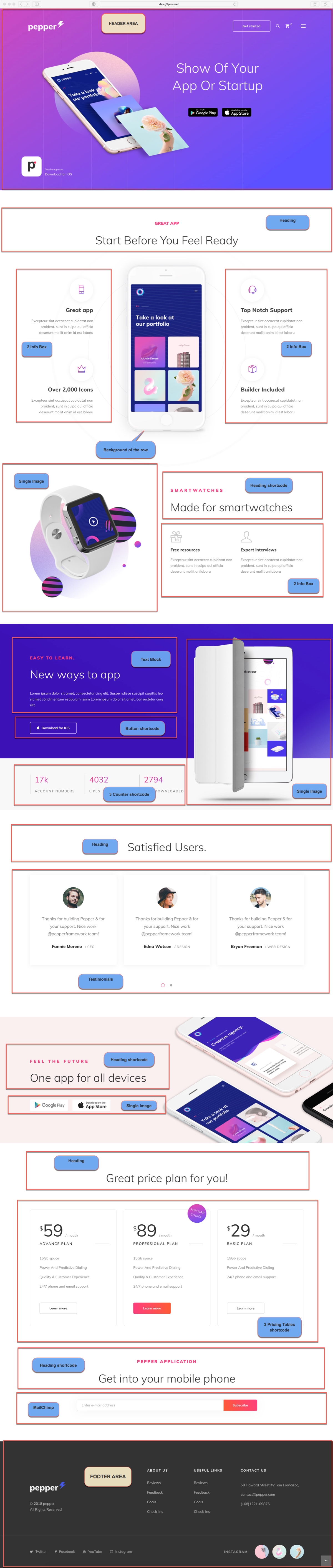
You can setup options in Theme Options (which will affect to entire website) or create a new Preset and apply to any page. Please consult this video guide on How to build Header Area. This process is similar to building Header Area on Pepper theme.
The screenshot below is an header area:
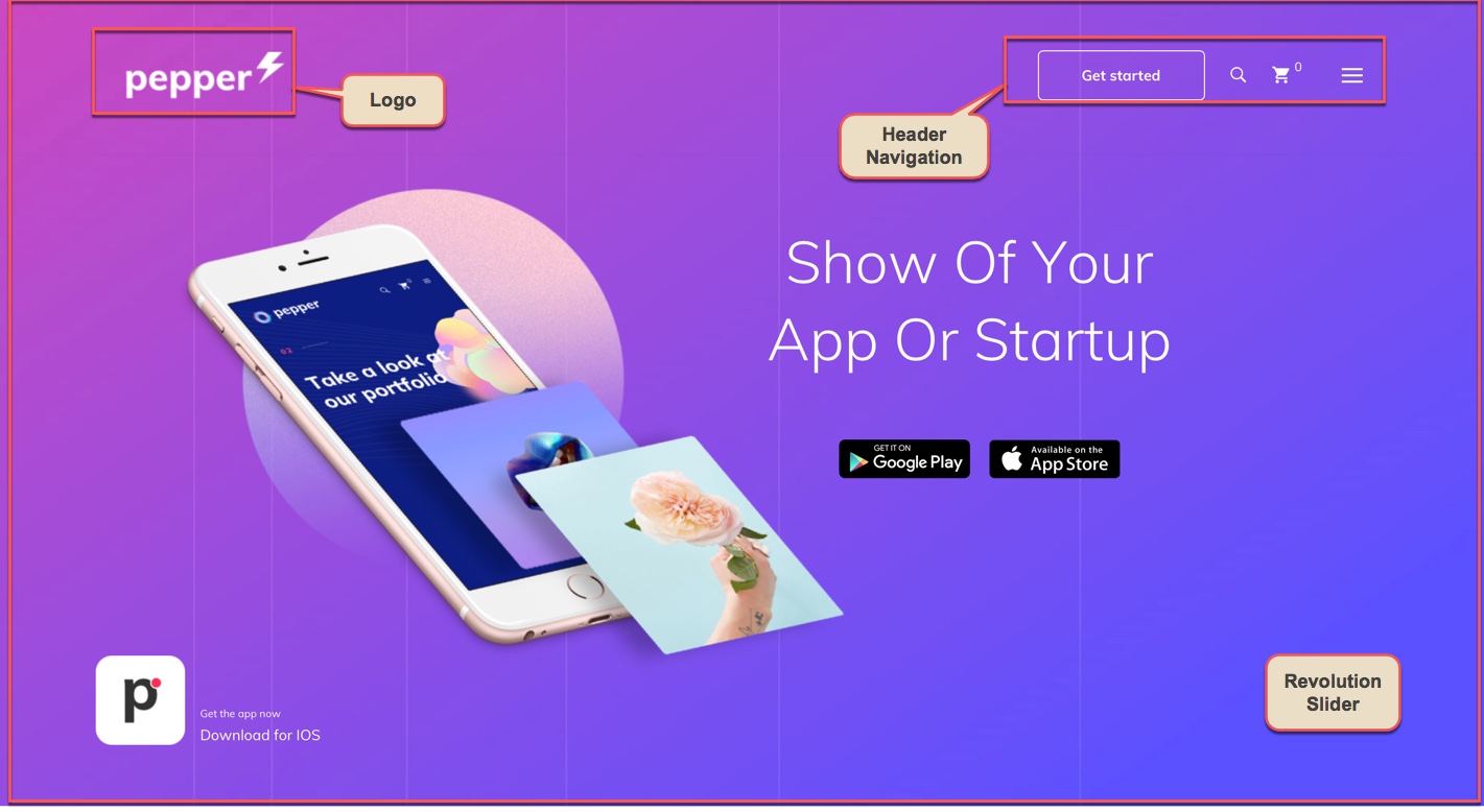
If you want apply this header to all your pages, setup by going to Theme Options → Header tab, In case you only want to apply this header for some pages/posts such as homepage, please create a new Preset then setup options for Header Area as your liking as below. (You can consult Preset Options section for more details in use Preset)
Go to Theme Options → Logo tab, then change logo (please read detailed description below each item before upload):
The menu is one of the most important elements of the site. It provides your visitors with the information about site structure. If your menu has well-thought and conveniently grouped elements, you visitors will be able to find the needed section easily. You can also consult Mega Menu section to build an attractive menu by your own.
Navigate to Appearance → Menus section to manage all menus on your site and do follow as below screenshot:
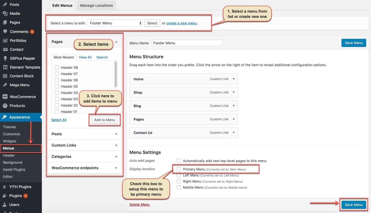
In the Menu Settings section, click to Primary Menu to setup this menu to be the main site menu and is used almost in all header styles and menu locations.
If you want to extra more fields to add to your menu, you can click on Screen Options and select:
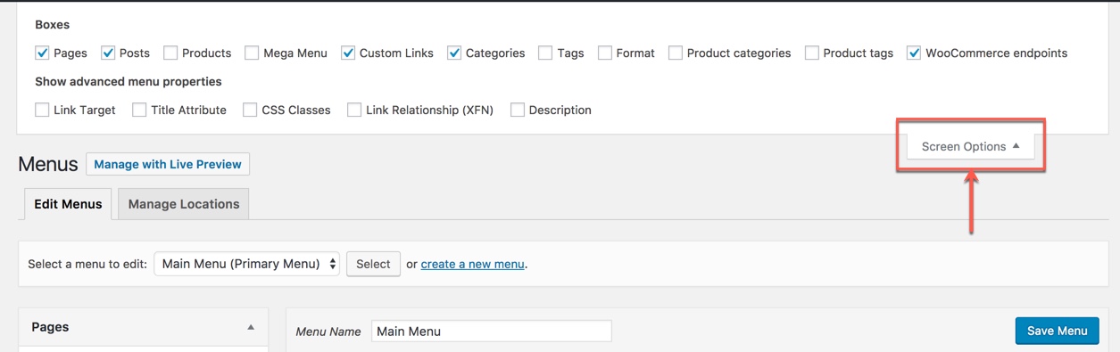
Finally, don't forget to Save Menu after everything is set properly and check it on the site.
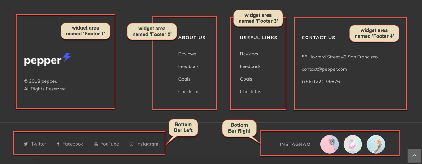
The screenshot below is demo Footer Area on the frontend
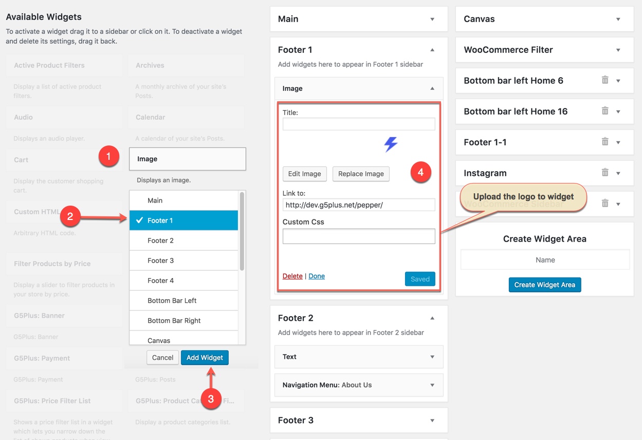
The work-flow to build this Footer Area is: Add widgets to the Widget Area, then create a new Content Block and setup this Block to be display as Footer.
Go to Widget Manager
Add Text widget and G5Plus: Infor Box widget to Footer 1 area
1. Add Image widget to Footer 1 area and setup as below:
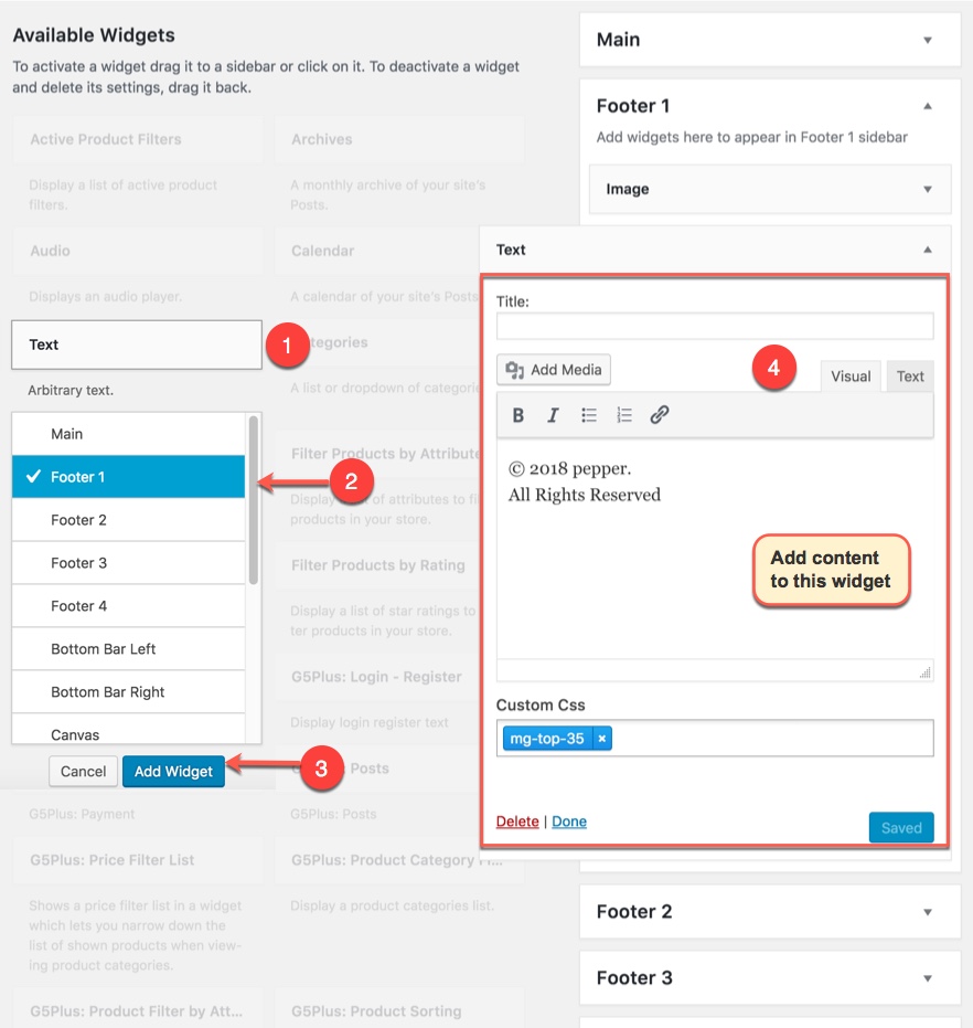
2. Add Text widget to Footer 1 area and setup as below:
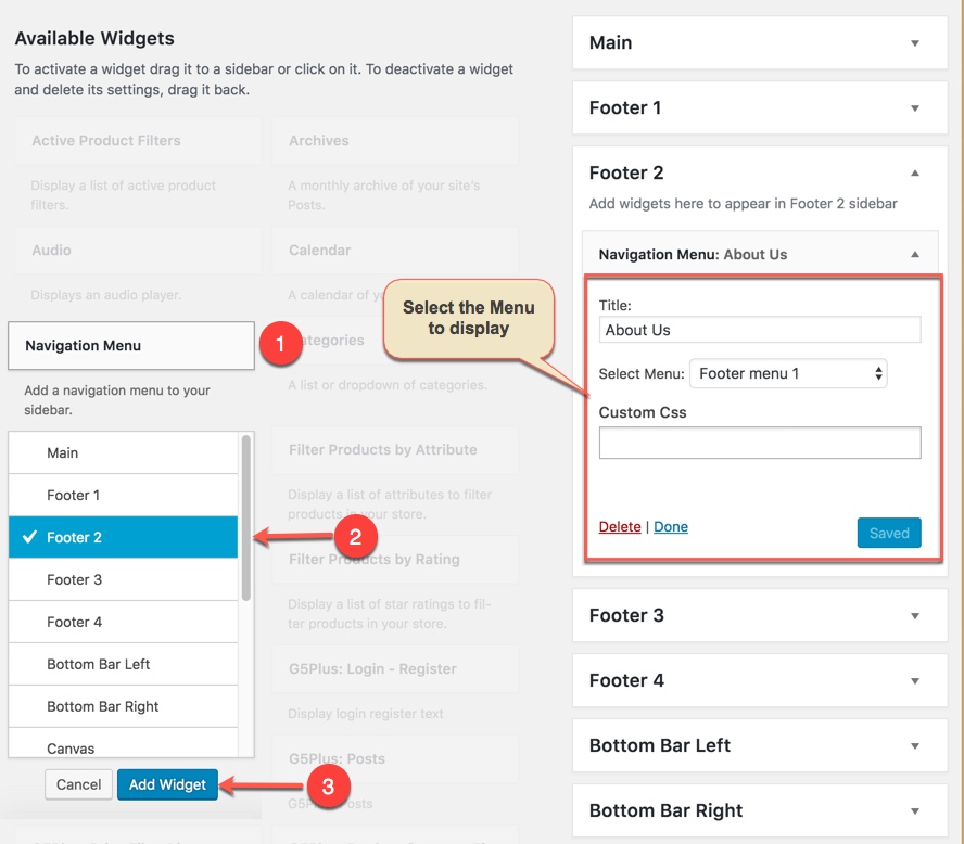
Add Navigation Menu widget to FOOTER 2 widget area
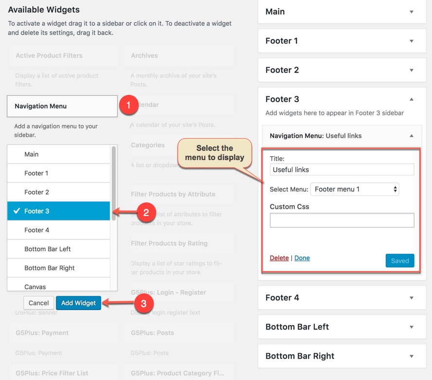
Similar to FOOTER 2 widget area, we add Navigation Menu widget to FOOTER 3 widget area:
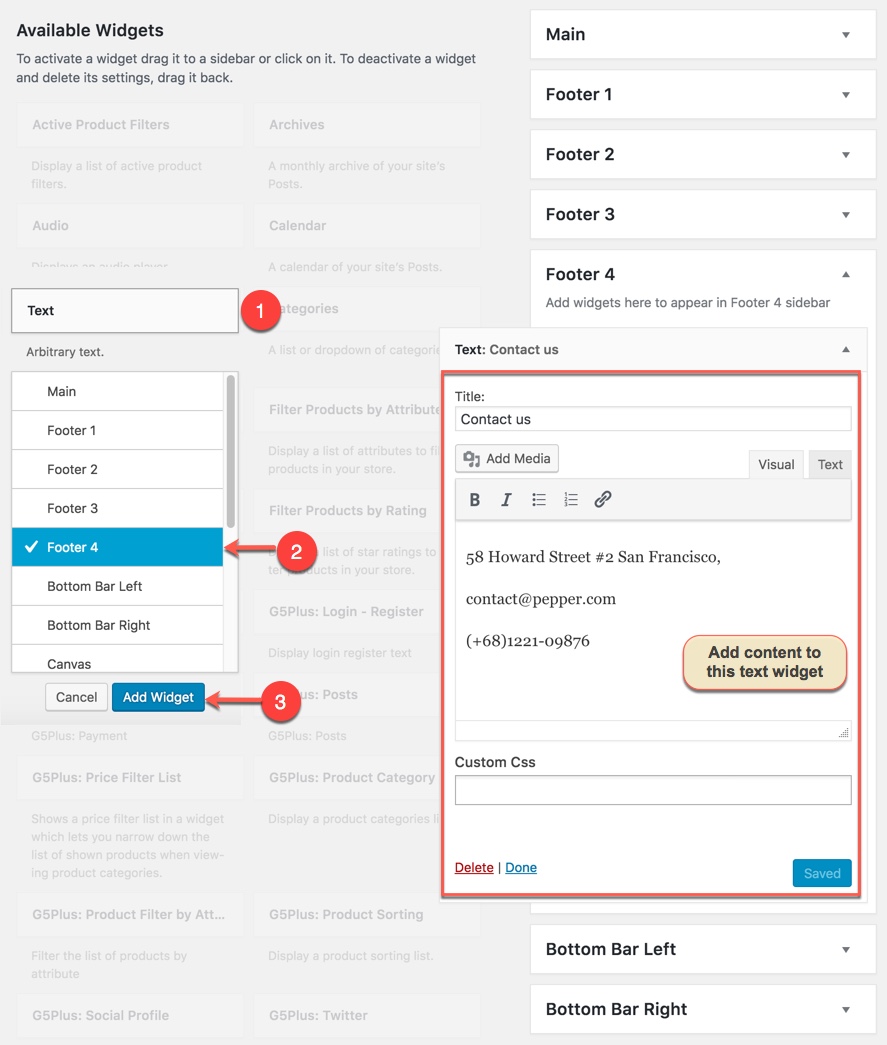
Add Text widget to Footer 4 area
Notice: You can create a new widget simply like this:
Add New Content Block for Footer area
You can use WPBakery Page Builder elements/shortcodes/templates to build your Footer Area as your liking
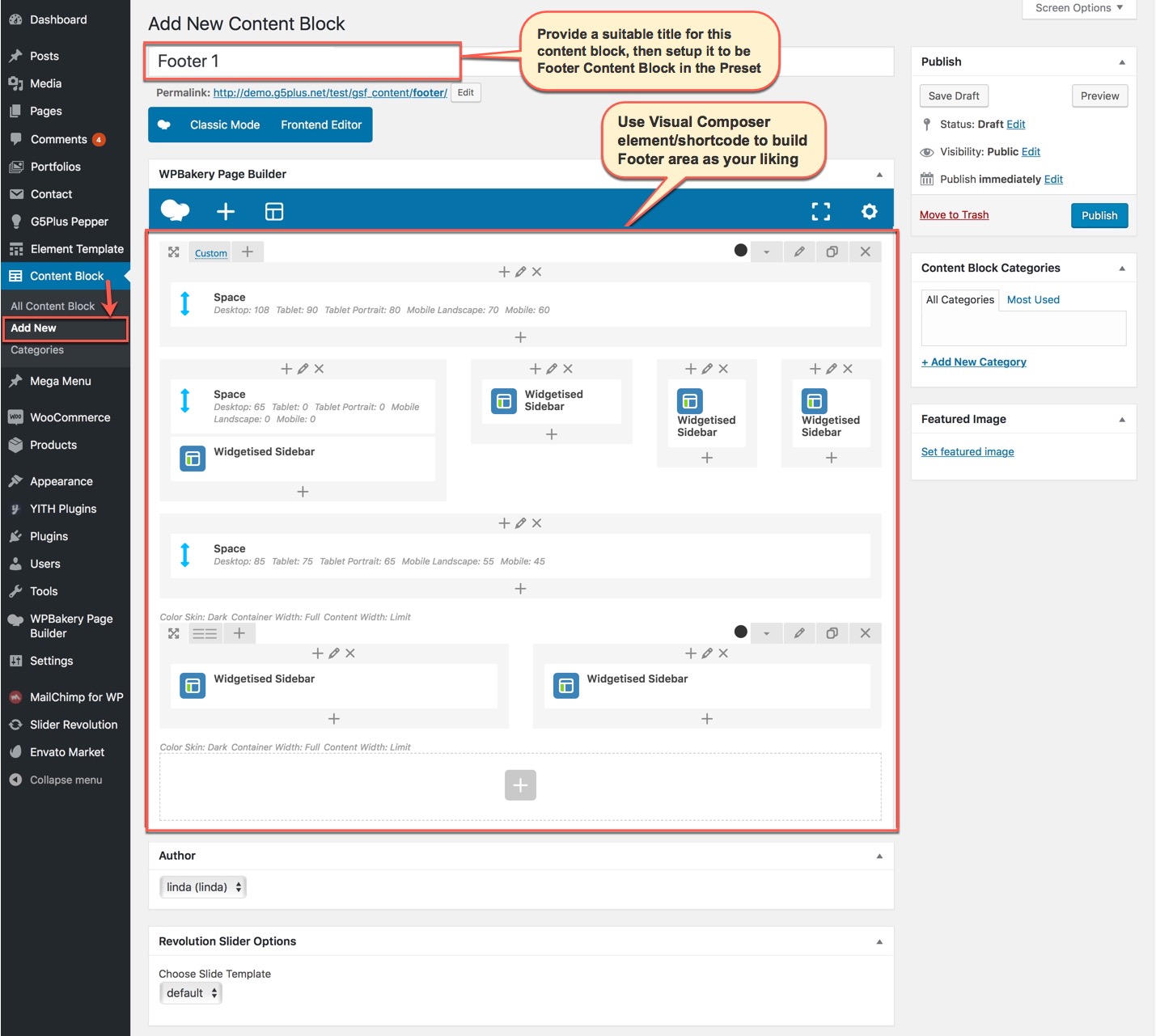
In this Content Block, We use shortcode of Widgetised Sidebar in WPBakery Page Builder to build Content Block and apply to Footer area.
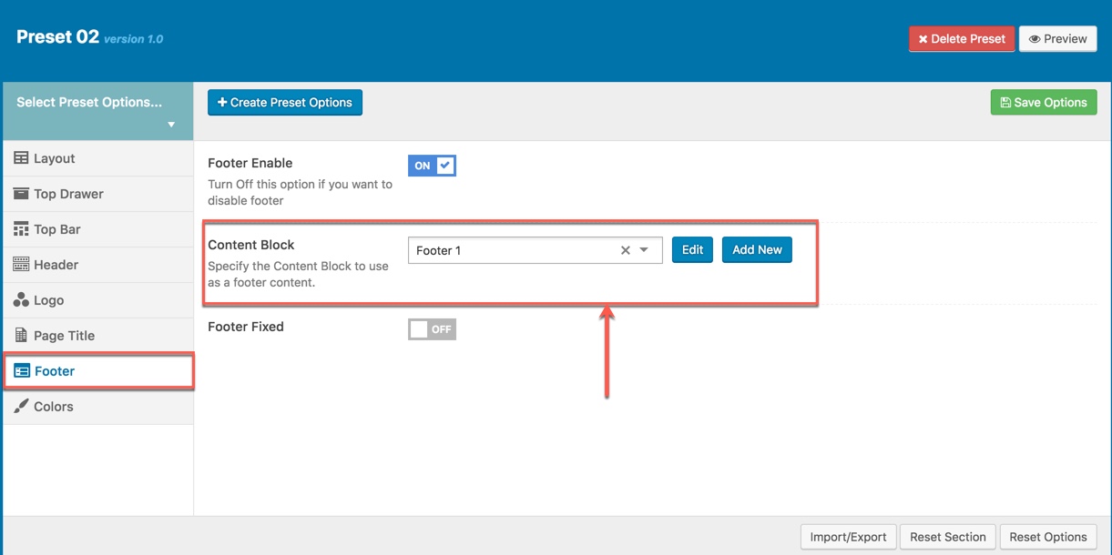
Specify the Content Block to use as a footer content in Theme Options
Go to Theme Options → Footer tab, then setup general options for Footer area and specify the Content Block to use as a footer content. In case you only want to apply this Footer for some pages/posts such as homepage, you need to create a new Preset then setup options for Footer Area as your liking as below. (You can consult Preset Options section for more details in use Preset)
After setting up the homepage, you need to setup the slider for homepage to make it display the same as in live preview. The download package contains the exported slider (Revolution Slider) that can be used as your slider template. Please follow the steps below to import it to your shop:
You could consult our video guide on How to Import Slider using Revolution Slider


Please note that these steps are to set up slider for homepage the same as in live demo. If you want to make your own slider, please follow the official Slider Revolution document.
Contact form 7 is used to create ‘easy to handle’ and ‘easy to customize’ forms. To get all forms, ‘Contact Form 7’ plugin must be installed and activated. You can add/edit/delete the contact form by following this documentation
You can do step by step as image below to build contact form:


You can visit Contact Form 7 Plugin to further details. Or copy and paste content to Form field like this:
You can also add/edit/delete the contact form, in our demo data there are 4 pre-built forms:

People all around the world use WordPress, around 44% of WordPress websites are written in a language other than English. We’re about to show you how to translate our themes. Using Make as an example, we’ll show you how to translate Pepper theme to Vietnamese, to be precise!
We will using Loco Translate plugin that provides in-browser editing of WordPress translation files.
Please confsult our video guide on How to translate G5THEME Theme using LOCO Translate plugin, We have been use Mowasalat theme for example and the process of Pepper theme translation is similar to this.
You can consult our guide here: http://support.g5plus.net/knowledge-base/how-to-create-a-multilingual-wordpress-website/ for further details about how to create a multilingual site.
If you installed PEPPER demo Data, you don’t need to create a new Home Page, you just need to choose from the list Home Pages that were automatically created from the demo content, following these steps:
Save all your changes!
You can adjust WordPress settings as follows:
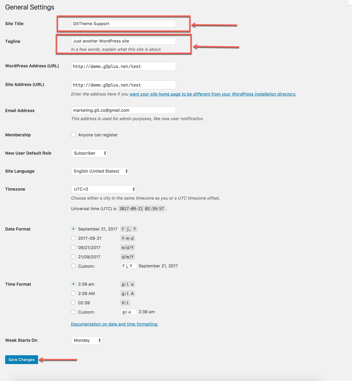
Step 1 – You can set Site Title, Tagline in Settings → General
Step 2 – You can set Blog pages show at most in Settings → Writing
Step 3
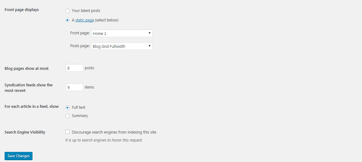
If you installed PEPPER Demo Data, you don’t need to create a new Home Page, you just need to choose from the list Home Pages that were automatically created from the demo content. You can select Front Page displays in Settings → Reading. Select A static page and Choose any homepage as you want from the dropdown for Front page
Click Save Changes
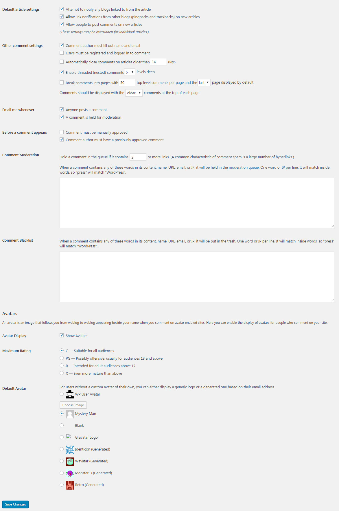
Step 4 – You can set Discussion settings in Settings → Discussion
Step 5 – You can change Image sizes in Settings → Media
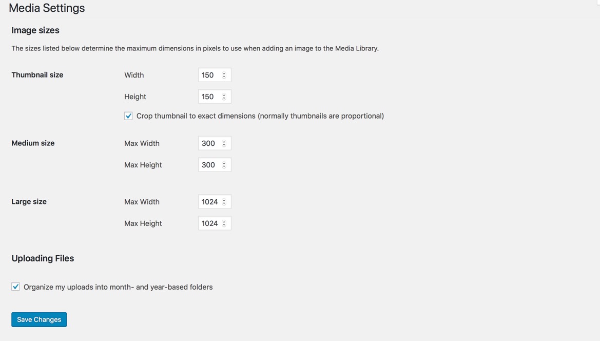
We used the following sizes on our demo sites:
Step 6 – You can set Permalink in Settings → Permalink
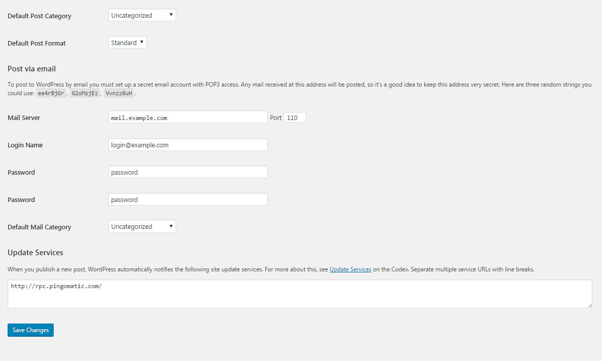
Step 7 – You can set Email settings in Settings → WP Mail SMTP
Using WP Mail SMTP Plugin to reconfigures the wp_mail() function to use SMTP instead of mail() and creates an options page that allows you to specify various options.
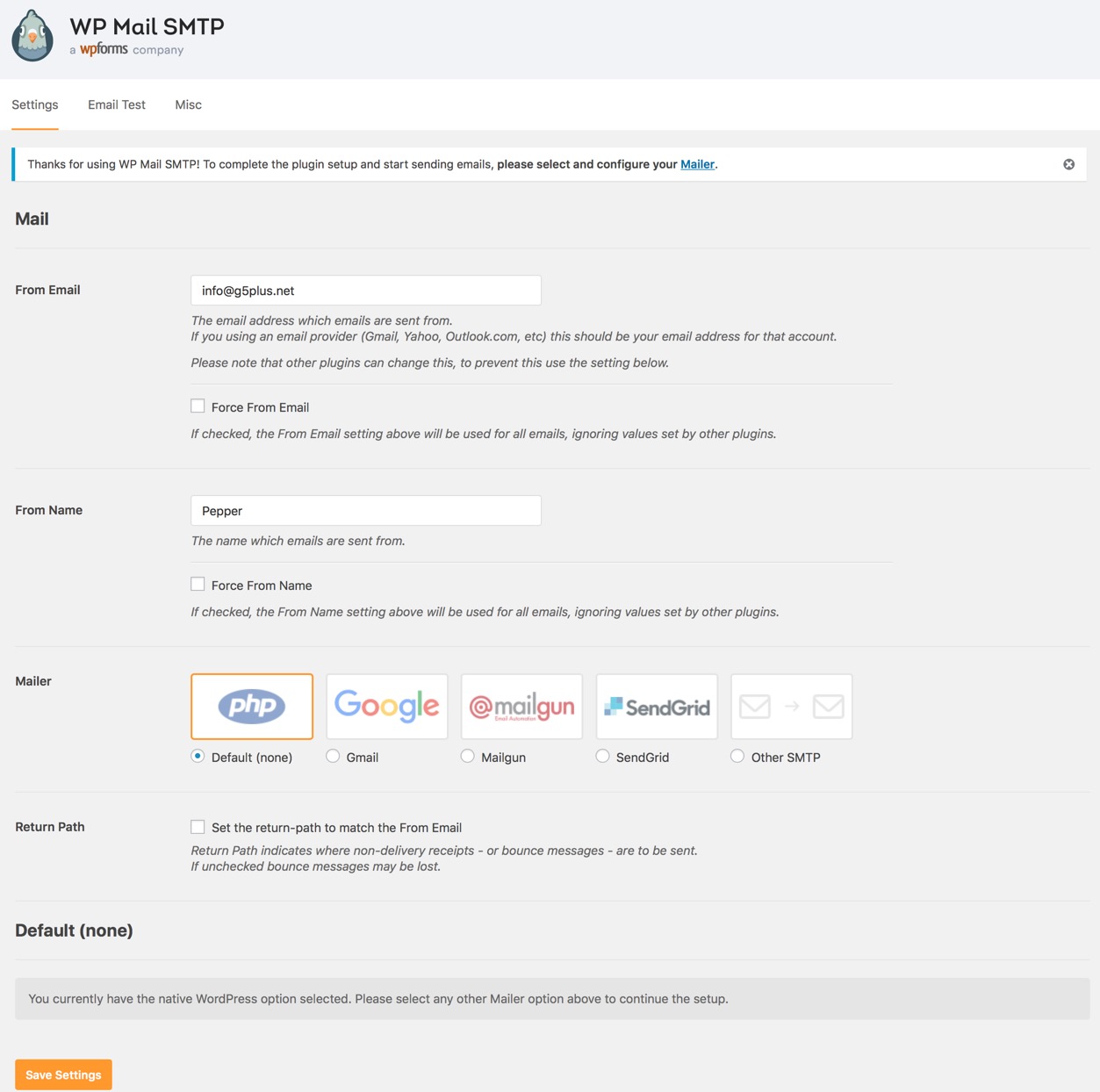
You can visit WP Mail SMTP Plugin to further details about this plugin and consult our guide to configure email: http://support.g5plus.net/knowledge-base/how-to-config-email-sent/.
Page Settings is one of the Pepper's features that located within each page and post. Page Settings will only affect the individual page you change them on and overrides options set in the Theme Options and Preset (If this page/post applied any preset).
You could consult our guide on How G5Them Options work for more details about the relationship between Theme Options, Preset and Page Settings
From WP-dashboard, navigate to Page → Add New.

Page Settings that located within each PAGE has 2 sections: General and Menu section.
Any option that was set to be Default or Customize Off means that it will use the value of equivalence option you have set in Preset (if this page apply any Preset) or Theme Options. Insert a different value to override the Preset/ Theme Option value.
Preset and Page Options will use the Theme Options value if left empty or if the value is default. They will override Theme Options if any other value is entered. This setup gives users maximum flexibility for setting a global theme option, then being able to override it on a page/post/shortcode basis
From WP-dashboard, navigate to Post → Add New.

Post Settings that located within each POST has 4 section: General section, Menu section, Single Post section and Related Posts section. General and Menu section is similar to Page Setting in Pages, and Post Settings in Posts have 2 more sections for post settings as below:


Any option that was set to be Default or Inhirit means that it will use the value of equivalence option you have set in Blog panel in Theme Options. Insert a different value to override the Theme Option value.
Post formats are used to style and display a post according to a specific content. Pepper theme supports all Post Formats other than the "Standard" post format. Let's see how to use post formats from your post editor.
Setup your post normally and add images to gallery by upload or choose from media library.

Setup your post normally and set a featured image, then copy the embed code of the video from YouTube, Vimeo or any other site that WordPress supports Embed for that site. Paste the code in the Featured Video Code field.

Setup your post normally and add URL and Text to fields. Adding link post format is like normal/standard post format but the theme automatically links the featured image to the URL


WordPress supports embedding into posts by default .Setup your post normally and add audio URL into the Audio Code field to place audio player in top of post page.

Preset are Options that were set beforehand to facilitate use, it will override settings in Theme Options on all pages/posts applyed it. pepper Demo Data also has many demo presets which lets you create WordPress pages very easily.
From WP-dashboard, navigate to G5Plus pepper → Theme Options.

1. Manage all presets: From the interface of Theme Options, you can manage all presets list, choose a preset to edit/delete or preview it on the frontend


2. Preset Setting: Preset Setting in Theme Options is a option that you can choose a Preset to apply for each page type (404 page/blog/woocommerce)

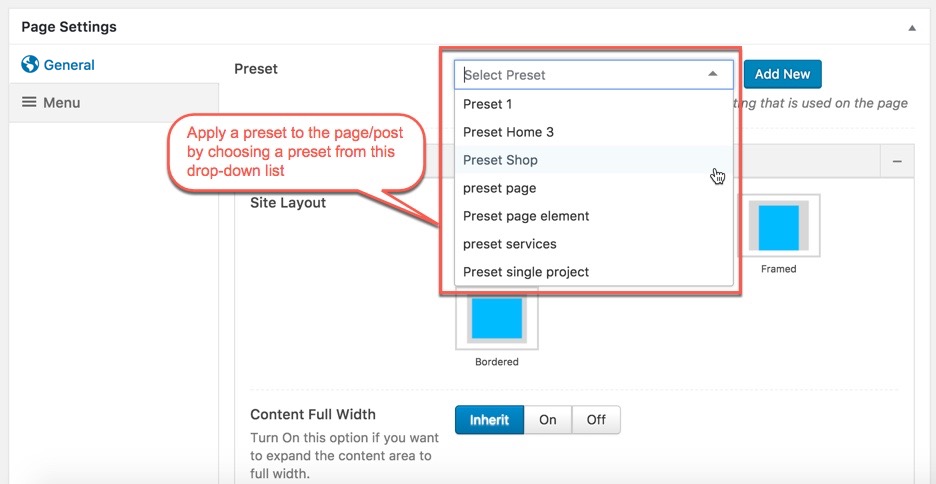
When you create a new page/post or edit a page/post, you can choose a preset from drop-down list then apply the preset to the page/post. All settings in the preset will be applied for this page/post and override settings in Theme Options. You can also Edit or Add New Preset by click on buttons next to drop-down list.

From a page that has been applied a Preset on the frontend, you can edit the Preset by clicking to Edit Preset button

NOTE: Preset and Page Settings will use the Theme Options value if left empty or if the value is default. They will override Theme Options if any other value is entered. This setup gives users maximum flexibility for setting a global theme option, then being able to override it on a page/post/shortcode basis. You can consult our guide on How to use Preset for more informations.
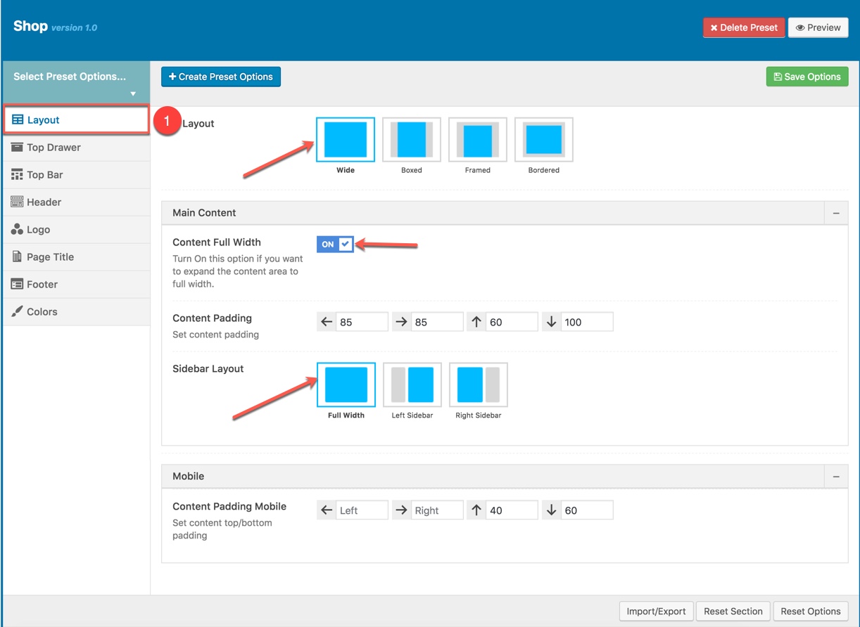
You can set the following Options for the Preset you are currently editing:
This option is used for setting Page Layout in a Preset. It will overwrite Page Layout settings in Theme Options. Any option is set to "Default" which means they will take on the global options set in Pepper theme Options

Page Layout Options for the Preset:
| Attribute | Description |
|---|---|
| Size Layout | You can set layout: WWide, boxed, framed, bordered |
| Main Content | |
| Content Full width | Enable/Disable option that expand the content area to full width |
| Content Padding | Set content padding |
| Sidebar layout | Select widget area to display as sidebar |
| Mobile | |
| Content Padding Mobile | Set content top/bottom padding mobile. Do not include units (empty to set default) |
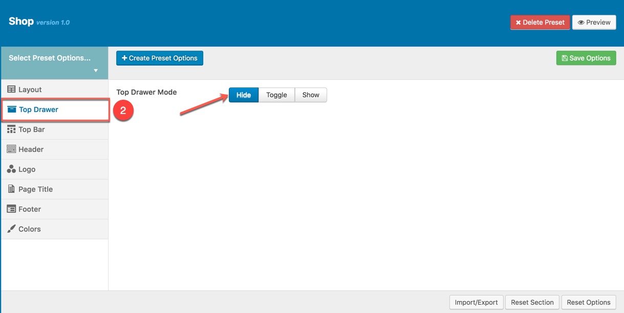
This option is used for setting Top Drawer in a Preset. It will overwrite Top Drawer settings in Theme Options. Any option is set to "Default" which means they will take on the global options set in Pepper theme Options

Top Drawer Options for the Preset:
| Attribute | Description |
|---|---|
| Top Drawer Mode | Set type of top drawer: 'Hide', 'Show', 'Toggle'. |
| Content Block | Select Content Block from list to use as a top drawer content. |
| Top Drawer Full width | Set status: On if you want to expand the content area to full width. |
| Padding | Set Padding space for top drawer included: padding-left, paaging-right, padding-top, padding-bottom. |
| Border bottom | Set the border bottom mode: none, full, container |
| Mobile enable | Set mobile enable:on, off |
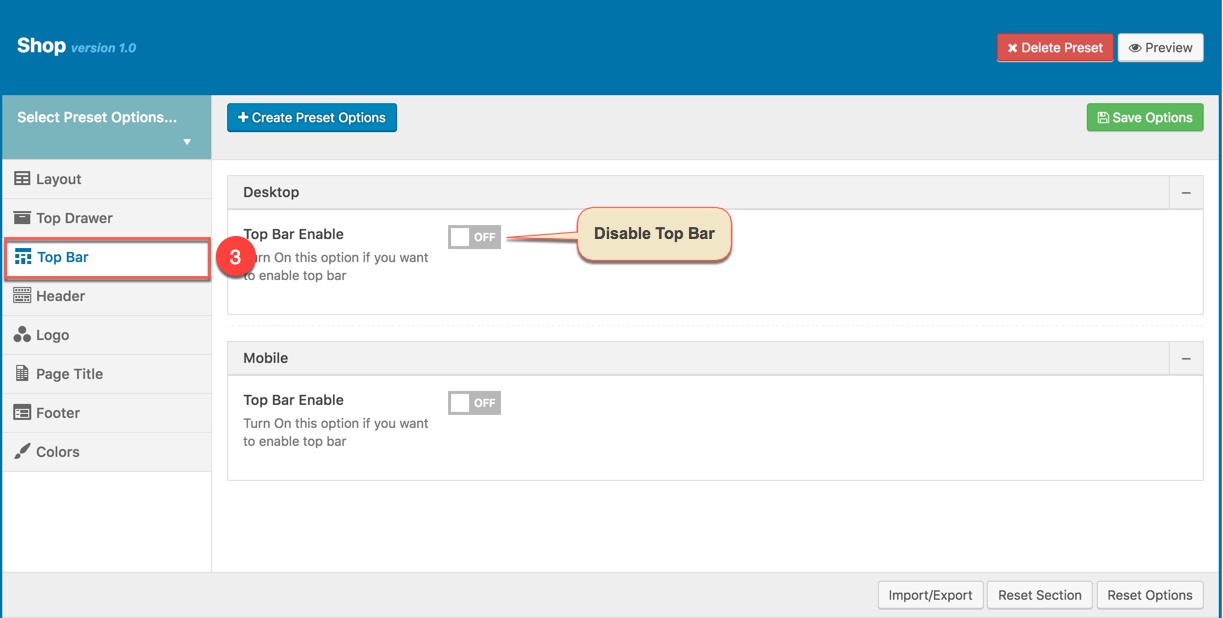
This option is used for setting Top Bar in a Preset. It will overwrite Top Bar settings in Theme Options. Any option is set to "Default" which means they will take on the global options set in Pepper theme Options

Top Bar Options for the Preset:
| Desktop | |
| Top Bar Enable | Enable/Disable Top Bar |
| Content Block | Set type to use as a top bar content. |
| Top Bar Full Width | Enable/Disable option that expand the content area to full width |
| Padding | Set Padding space for website include: padding-left, paaging-right... |
| Border bottom | Set the border bottom mode: none, full, container |
| Mobile | |
| Mobile enable | Set mobile enable:on, off |
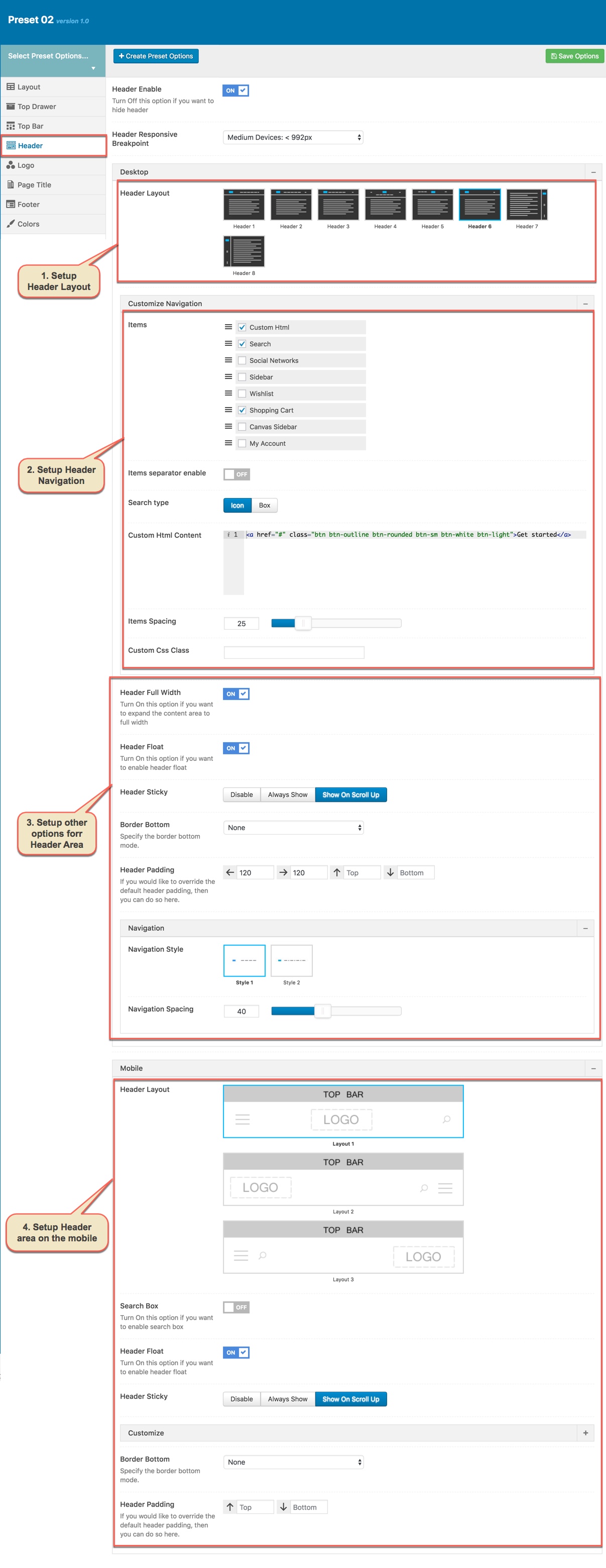
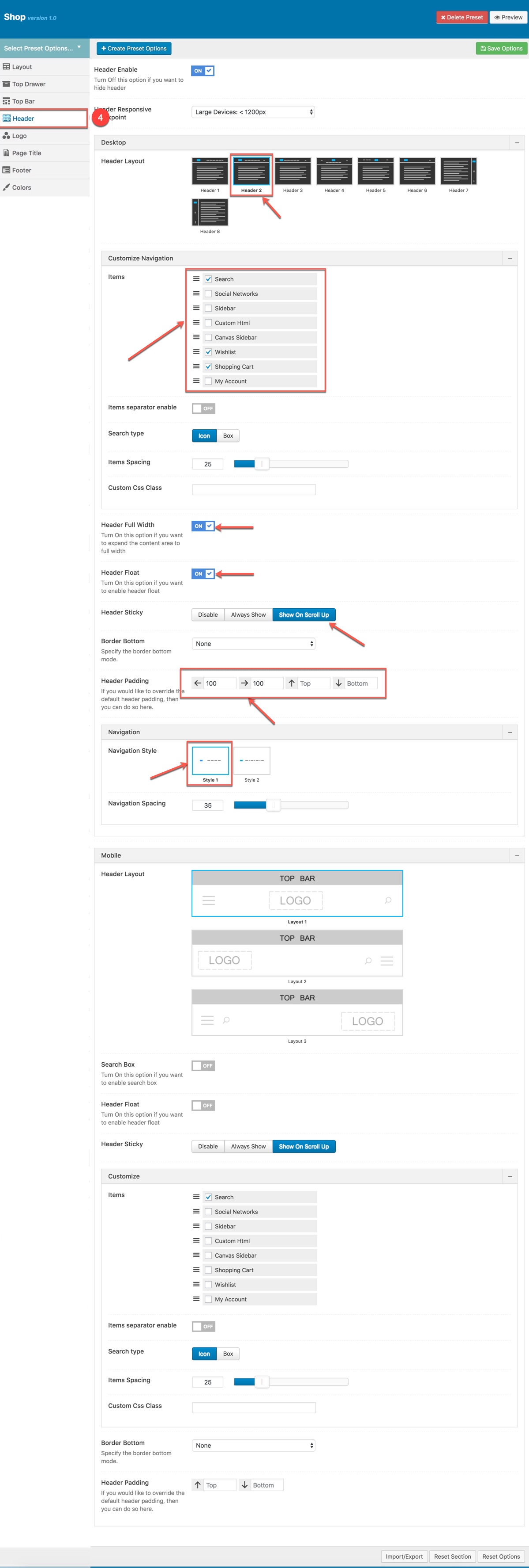
By-default, Header is functioning from Theme Options for all pages. If you want a different header for a page, then you can setup "Header" in this preset and apply it to that specific page.
Header option is used for setting Header in a Preset. It will overwrite Header settings in Theme Options. Any option is set to Default which is the current header style of your Theme Option. So, if you want same header on all pages, then you don't need to select anything. If you want a different header for a specific page, then you can choose any other option as your wish.

Description of Header Options for this Preset
| Attribute | Description |
|---|---|
| Header Enable | Set enable/disable of header |
| Header Responsive Breakpoint | You can response with 3 screens of devide |
| Header Layout | Set layout of header in Desktop |
| Customize Navigation | Set navigation, space between them and you can add CSS if you want |
| Header Full Width | Set enable of full width header |
| Header Float | Set enable float for header |
| Header Sticky | Set sticky mode for header:on, off |
| Border bottom | Select Header border bottom, include: None, Full Border, Container Border |
| Header padding | Set Padding top/bottom for Header area. If selected default will take value in Theme Options |
| Navigation Style | Select Navigation Style between 2 styles. |
| Navigation Spacing | Set Navigation Spacing(px) by draging scroll bar . |
| Page Header Mobile | |
| Header Mobile Layout | Set layout fot header mobile. |
| Header Float | Turn On/Off this option if you want to enable/disable header float |
| Mobile Header Search Box | Set visible for search box by turning on/off option. |
| Header mobile sticky | Set sticky mode for mobile header. |
| Customize | Add items, space between them and custom CSS (if you want) |
| Border bottom | Set border bottom: Full, container, none. |
| Header padding | Set header padding space |
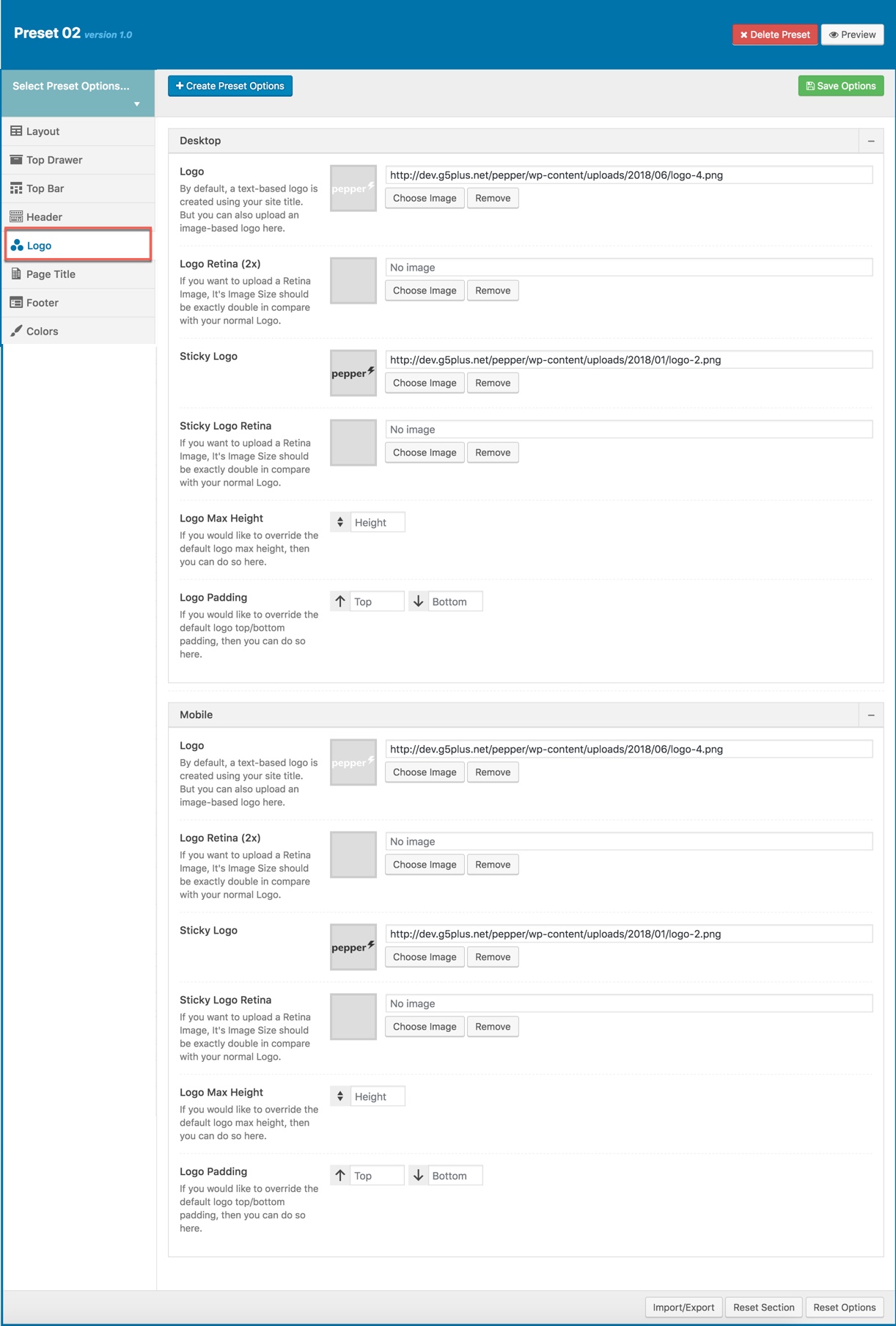
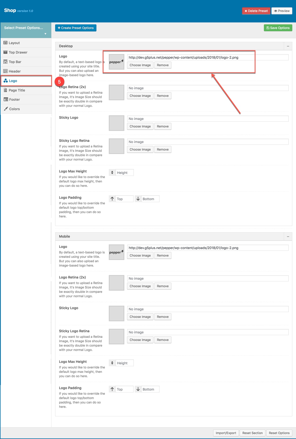
Logo panel has all options for you to setting how logo display on pages that are applied this preset. It will overwrite Logo settings in Theme Options. Any option is set to "Default" which means they will take on the global options set in Pepper theme Options
You can set the following Logo Options for the Page you are currently editing:
| Attribute | Description |
|---|---|
| Logo Desktop | |
| Logo | Upload header logo if you want custom header logo for page used this preset. |
| Logo Retina | Upload Header Logo Retina for retina if you want custom Header Logo Retina for page used this preset |
| Sticky Logo | Upload logo sticky if you want custom logo for page used preset. |
| Sticky Logo Retina | Upload logo sticky for retina if you want custom logo retina for page used this preset |
| Logo max height | Set max height for logo, if leave empty will take value in Theme Options |
| Logo padding | Set padding for logo, if leave empty will take value in Theme Options |
| Logo Mobile | |
| Logo | Upload logo if you want custom logo mobile for page used this preset. |
| Logo Retina | Upload logo mobile for retina if you want custom logo retina for page used this preset |
| Mobile Logo Max Height | Set max height for logo mobile, if leave empty will take value in Theme Options |
| Mobile Logo Padding | Set padding top/bottom for logo, if leave empty will take value in Theme Options |
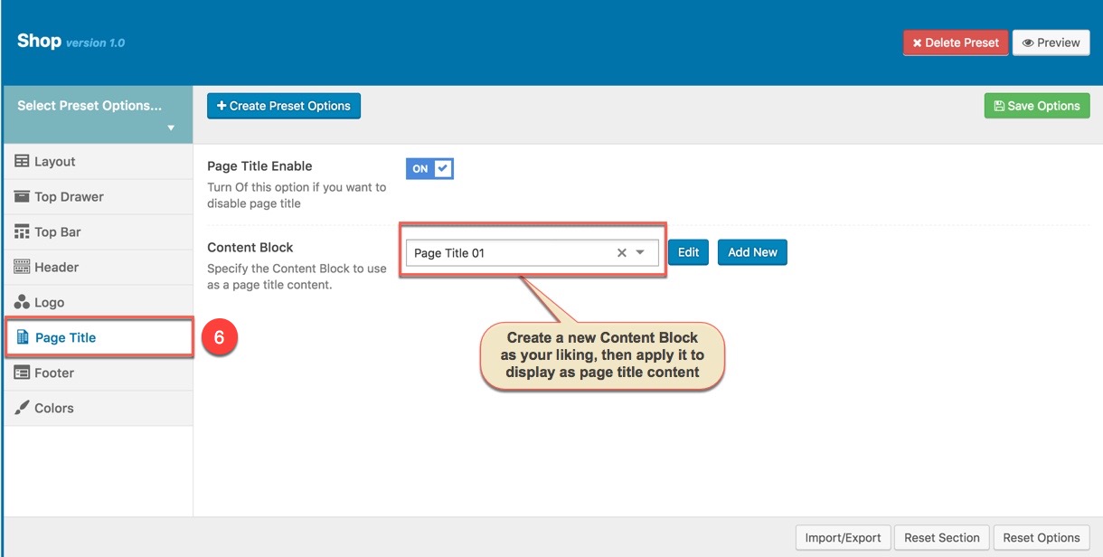
This option is used for setting Page Title in a Preset. It will overwrite Page Title settings in Theme Options. Any option is set to "Default" which means they will take on the global options set in Pepper theme Options

You can set the following Page Title Options for the Preset you are currently editing:
| Attribute | Description |
|---|---|
| Page Title Enable | Set visible for Page Title, turn Off this option if you want to disable page title |
| Content Block | Set Content Block have been built for Page Title from list |
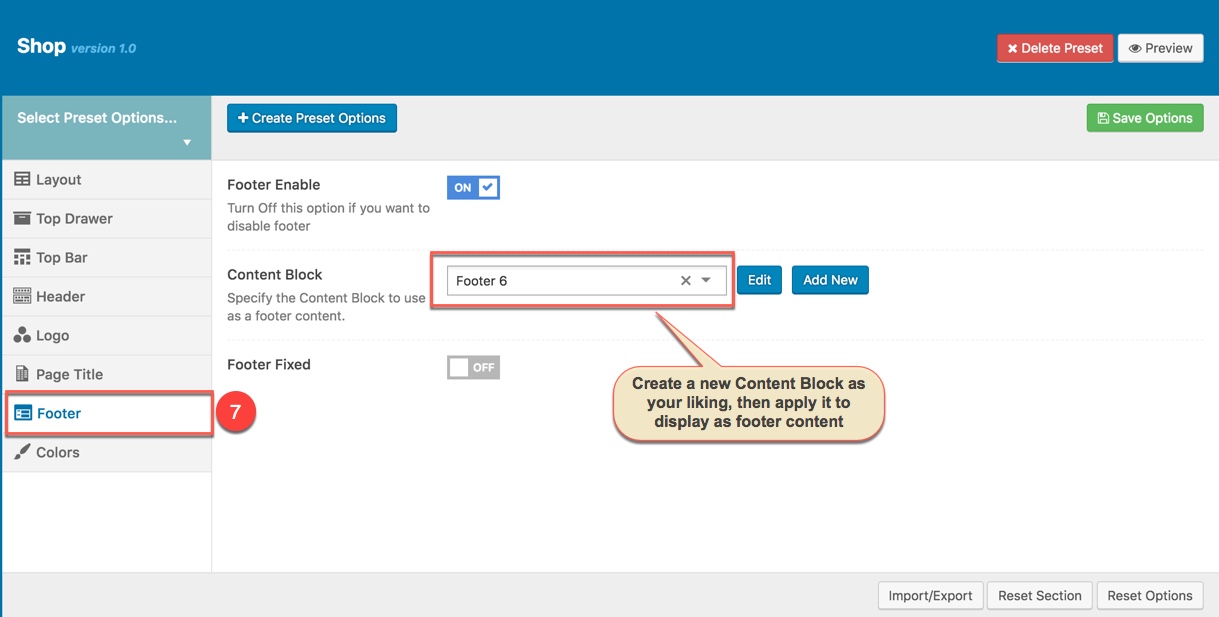
This option is used for setting Footer in a Preset. It will overwrite Footer settings in Theme Options.

You can set the following Footer Options for the Page you are currently editing:
| Attribute | Description |
|---|---|
| Footer Enable | Set visible of footer, if selected default will take value in Theme Options |
| Content Block | Select content block for footer |
| Footer Fixed | Set Footer Fixed: on or off |
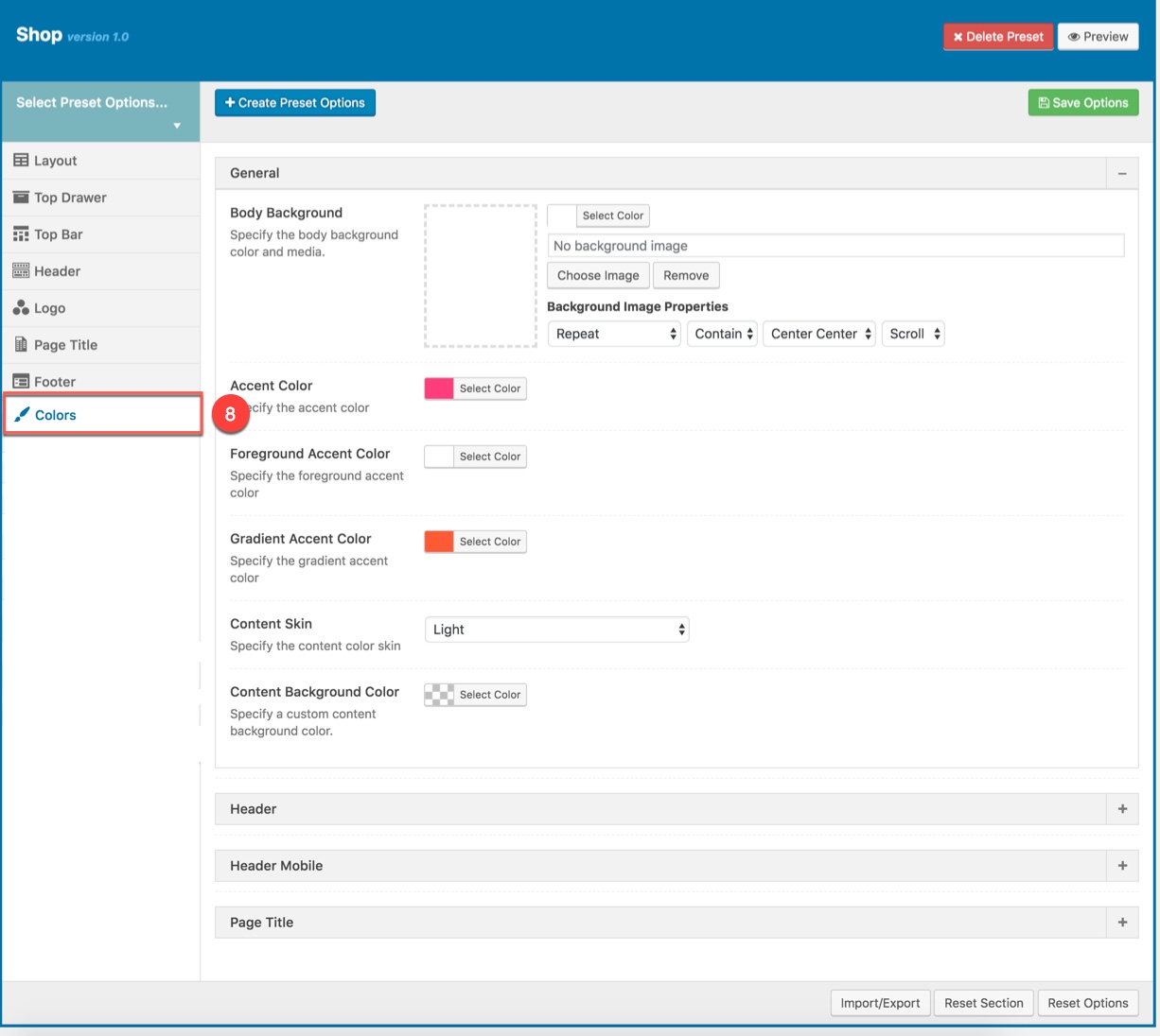
This panel is used for setting Colors in a Preset. From here you can custom and change color options for each area on page (pages are applied this preset). You can custom and choose custom color skin to display here. Please consult Skin section for more details.

Color Options :
| Attribute | Description |
|---|---|
| General | |
| Body Background | Customize the body background color and media |
| Accent Color | Customize color for Accent Area |
| Foreground Accent color | Customize Foreground Accent color |
| Gradient Accent color | Specify the gradient accent color |
| Content Skin | Select the content color skin |
| Content Background color | Select Background color |
| Top Drawer | |
| Top Drawer Skin | Specify the top drawer color skin from skins list |
| Top Drawer Background Color | Specify a custom Top Drawer background color |
| Header | |
| Header Skin | Specify the header color skin from skins list |
| Header Background Color | Specify a custom header background color |
| Header Sticky Skin | Select the skin to display as header sticky from skins list |
| Header Background Color | Specify a custom header background color |
| Menu | |
| Top Drawer Skin | Specify the navigation color skin by selecting a skin from list |
| Top Drawer Background Color | Specify a custom navigation background color |
| Header Mobile | |
| Header Mobile Skin | Select the Header Mobile color skin from skins list |
| Header Mobile Background Color | Specify a custom Header Mobile background color |
| Page Title | |
| Page Title Skin | Select the Page Title color skin from skins list |
| Page Title Background Color | Specify a custom Page Title background color |
Examples in this documentation just a glimpse of what you can achive by using renewal options in the Pepper theme. Let's discover pepper by your own!
Example using Preset to setup the full width Woocommerce shop page (as this site)
Step 1: Create a new Preset named Shop then setup options for the Preset that will be applied for Woocommerce shop page.
8 separates of Preset options will be setup as below:
Step 2: Apply the preset named Shop Preset for Woocommerce Product Listing in Theme Options.

Do not forget to setup for Woocommerce elements in Theme Options (Please consult Woocommerce option in Theme Options) and main Woocommerce Settings. And the screenshot below is your result:

Note: As mentioned above, you can also apply Preset to each Page/Post if you want.
When you create a new page/post or edit a page/post, you can choose a preset from drop-down list then apply the preset to the page/post. All settings in the preset will be applied for this page/post (override settings in Theme Options).
From a page that has been applied a Preset on the frontend, you can edit the Preset by clicking to Edit Preset button
Theme Options located in WP Dashboard → G5Plus Pepper → Theme Options includes all global options that affect your entire website. These options can be overwritten by setting options in Page Settings (or Preset) with any page custom Page Settings (or apply Preset).
By clicking on the Theme Options menu, you'll be able to change all settings that affect to entire your website.
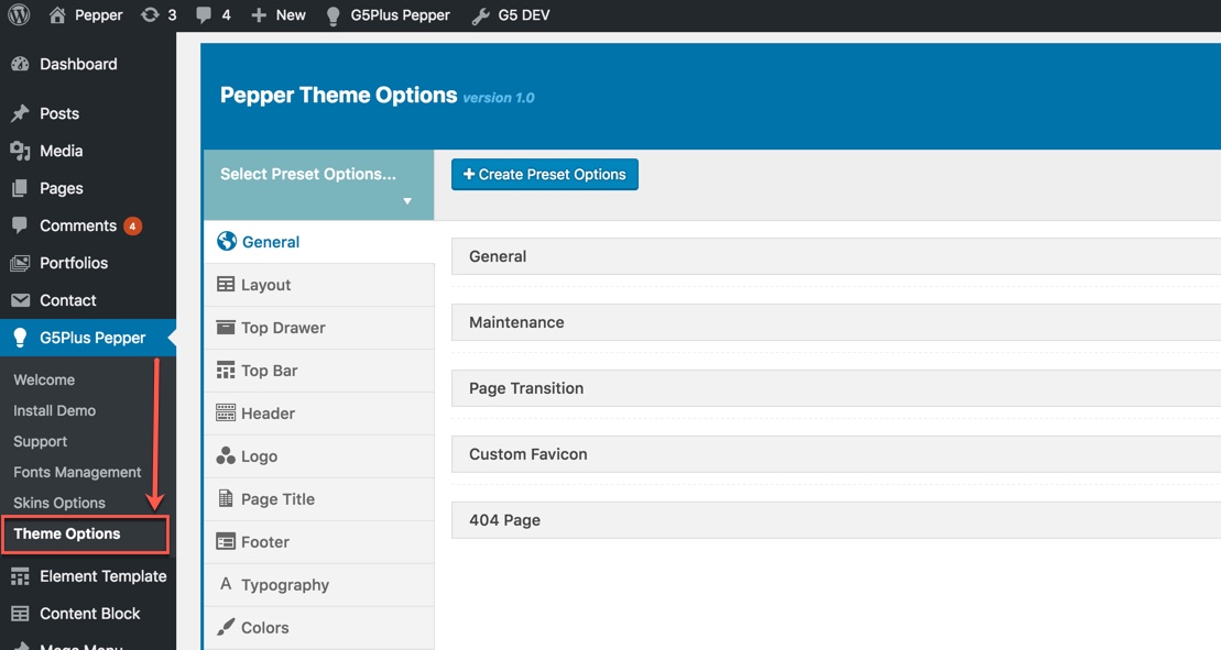
Theme Options are logically organnized into tabs, each tab contains all the options for that specific area within your site.
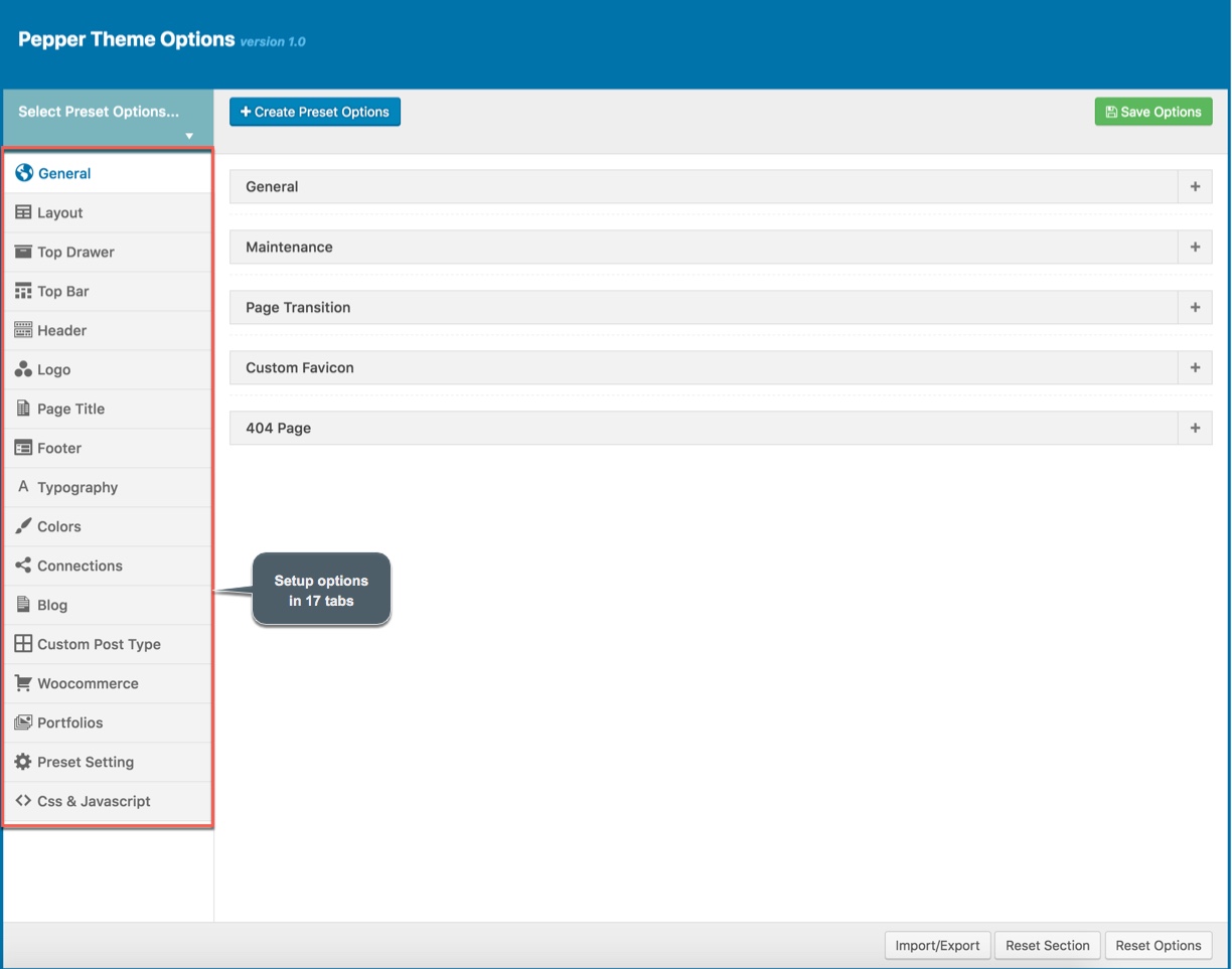
In ‘Theme Options’, there are 4 buttons namely - 'Save Options', 'Import/Export', 'Reset Section' and 'Reset Options'. After making all the changes in Theme Options, you can save everything by clicking on 'Save Options' button. In theme options, all options are in the form of tabs, viz; 'General', 'Header' etc. You can click on 'General' (or any other tab) and make changes therein. Now, if want to get back all default data of specific section i.e: 'General' (or any other section), then you should click on 'Reset Section'. Now, if you want to get back to default data/setting for all the Theme Options, then you need to click on 'Reset Options'.
With pepper, we integrated Preset to Theme Options, so you can also goto WP Dashboard → G5Plus Pepper → Theme Options to manage all Preset by create new or edit/preview/delete any preset from list.
You could consult our guide on How to use Theme Options and How to use Preset for more detail about How to use Theme Options properly on your website.
We highly encourage you to explore the theme options and experimentwith what all the available options can do.
General tab is divided into a few sections. Asides from the Install demo Data section mentioned above, there are a few important sections for you to customize your layout.

Page Layout Options:
| Attribute | Description |
|---|---|
| Smooth scroll | Set Smooth scroll status: on, off |
| Lazy Load Image | Set Lazy Loadd Image status: on, off. If enabled, images will only be loaded when they come to view |
| Custom Scroll | Set Custom Scroll status: on, off |
| Back to Top | Set Back to Top status: on, off |
| RTL Mode | Set RTL Mode status: on, off. For languages that read from right-to-left unlike English which is left-to-right, switch RTL smode, as long as you it's in your language and uses the correct locale. |
| Google Map API Key | Input the Google Map API Key to display the map |
| Menu Transition | Set status: Fade on, Fade off, Fade in Up, Fadein dowwn... |
| Social Meta | Set Social Meta Tags status: on, off |
| Show Breadcrumb | Set Show/Hide the Breadcrumb |
| Show Post Categories in Breadcrumb | Set Show/Hide Post Categories in the breadcrumbs path. |
| Show Post Type Archives in Breadcrumb | Set Show/Hide Post Type Archives in the breadcrumbs path. |
| Search Popup | Set the Post Type For Ajax Search (post/page/product/portfolio) and the amount of Search Result |
| Maintenance | Set Maintenance Mode: On(Custom Page), On(Status Page), Off |
| Page Transition | Set Page Transition status: on, off |
| Custom Favicon | Set Custom Favicon with each screen size |
| 404 Page | Set Content Block and content for 404 page |
Layout Options has all options for setting site layout (pls read infomation below each option for more details)

You can set the following Page Layout Options for the Preset you are currently editing:
| Attribute | Description |
|---|---|
| Site Layout | You can select one of 4 layouts: Wide, boxed, framed, bordered |
| Main Content | |
| Content Full width | Enable/Disable option that expand the content area to full width |
| Sidebar layout | Select widget area to display as sidebar |
| Sidebar | Select sidebar to display or add new a sidebar |
| Sidebar width | Set width for the page sidebar: small (1/4) or large (1/3) |
| Sidebar Sticky | Set enable sidebar sticky for the page sidebar |
| Mobile | |
| Sidebar Mobile | Set enable sidebar on the mobile |
| Content Padding Mobile | Set content top/bottom padding mobile. Do not include units (empty to set default) |
Top Drawer contains all options for setting Top Drawer area. In pepper demo Data, Top Drawer has been hiden by default and Top Drawer area have had any widget yet. So if you want to enable Top Drawer please read carefully infomation below each option for more details.

Description of Top Drawer Options
| Attribute | Description |
|---|---|
| Top Drawer Mode | Set type of top drawer: 'Disable', 'Always Show', 'Toggle'. If selected default will take value in Theme Options |
| Content Block | Set type to use as a top drawer content. |
| Top Drawer Full width | Set Page Transition status: on, off |
| Padding | Set Padding space for website include: padding-left, paaging-right... |
| Border bottom | Set the border bottom mode: none, full, container |
| Mobile enable | Set mobile enable:on, off |
Top Bar contains all options for setting Top Bar area. You can use Content Block to display as Top Bar

Descriptions of Top Bar Options:
| Desktop | |
| Top Bar Enable | Enable/Disable Top Bar |
| Content Block | Specify the content block to use as a top bar content on Desktop. | Mobile |
| Mobile enable | Set mobile enable:on, off |
| Content Block | Specify the content block to use as a top bar content on Mobile. |
Header contains all options for setting Header Area such as Layout, Header Top/Bottom Padding.. and customize Header Area (pls read carefully infomation below each option for more details).

Description of Header Options
| Attribute | Description |
|---|---|
| Header Enable | Set enable of header |
| Header Responsive Breakpoint | You can response with 3 screens of devide | Desktop |
| Header Layout | Set layout of header in Desktop |
| Customize Navigation | Set navigation, space between them and you can add CSS if you want |
| Header Full Width | Set enable of full width header |
| Header Float | Set enable float for header |
| Header Sticky | Set sticky mode for header:on, off |
| Border bottom | Select Header border bottom, include: None, Full Border, Container Border |
| Header Above Border Bottom | Select Header Above Border Bottom , include: None, Full Border, Container Border |
| Header padding | Set Padding top/bottom for Header area. If selected default will take value in Theme Options |
| Navigation Style | Set Navigation style by selecting between 2 styles. |
| Navigation Spacing | Set Navigation Spacing(px) by draging scroll bar . |
| Page Header Mobile | |
| Header Mobile Layout | Set layout fot header mobile. |
| Mobile Header Search Box | Set visible for search box. |
| Header mobile float | Turn On this option if you want to enable header float |
| Header mobile sticky | Set sticky mode for mobile header. |
| Customize | Add items, search type, space between them and custom CSS (if you want) |
| Border bottom | Set the border bottom mode: Full, container, none. |
| Header padding | Set header padding space |
Logo contains all options for setting how logo display on page (pls read carefully infomation below each option for more details).
Description of Logo Options
| Attribute | Description |
|---|---|
| Logo Desktop | |
| Logo | Upload header logo if you want custom header logo for page used this preset. |
| Logo Retina | Upload Header Logo Retina for retina if you want custom Header Logo Retina for page used this preset |
| Sticky Logo | Upload logo sticky if you want custom logo for page used preset. |
| Sticky Logo Retina | Upload logo sticky for retina if you want custom logo retina for page used this preset |
| Logo max height | Set max height for logo, if leave empty will take value in Theme Options |
| Logo padding | Set padding for logo, if leave empty will take value in Theme Options |
| Logo Mobile | |
| Logo | Upload logo if you want custom logo mobile for page used this preset. |
| Logo Retina | Upload logo mobile for retina if you want custom logo retina for page used this preset |
| Mobile Logo Max Height | Set max height for logo mobile, if leave empty will take value in Theme Options |
| Mobile Logo Padding | Set padding top/bottom for logo, if leave empty will take value in Theme Options |
Page Title has options for setting Page Title. You can select the Content Block to displays as a page title content.

You can set the following Page Title Options for the Preset you are currently editing:
| Attribute | Description |
|---|---|
| Show/Hide Page Title? | Set visible of Page Title, if selected default will take value in Theme Options |
| Content Block | Set Content Block have been built for Page Title from list |
Footer panel contains all options for setting Footer Area (pls read infomation below each option for more details).

| Attribute | Description |
|---|---|
| Footer Enable | Set visible of footer, if selected default will take value in Theme Options |
| Footer Fixed | Set Footer Fixed: On or Off |
| Content Block | Select content block for footer |
Typography allows users to specify font properties to display as body font, primary font, menu font... All fonts are managed in Fonts Management custom/upload fonts on website.

| Attribute | Description |
|---|---|
| General | |
| Body font | Included: Font Family(name of font), Font Size, Font Weight. |
| Primary font | Included: Font Family(name of font) |
| Heading Font | |
| H1 Font | Specify the H1 font (Font family, Font size, Font Weight & Style) |
| H2 Font | Specify the H2 font (Font family, Font size, Font Weight & Style) |
| H3 Font | Specify the H3 font (Font family, Font size, Font Weight & Style) |
| Menu | |
| Menu Font | Specify Font Family(name of font), Font Size, Font Weight for the menu |
| Sub Menu Font | Specify Font Family(name of font), Font Size, Font Weight for the sub menu |
| Mobile Font | Specify the Font Family(name of font), Font Size, Font Weight for the menu on mobile |
Color panel allows users to custom and change color options for each area on page. You can custom and choose custom color skin to display here. Please consult Skin Options section for more details.

You can set color for each area on page :
| Attribute | Description |
|---|---|
| General | |
| Body Background | Customize the body background color and media |
| Accent Color | Specify the accent color |
| Foreground Accent color | Specify the Foreground Accent color |
| Gradient Accent color | Specify the Gradient Accent color |
| Content Skin | Select the content color skin |
| Content Background color | Select Background color |
| Top Drawer | |
| Top Drawer Skin | Specify the Top Drawer color skin from skins list |
| Top Drawer Background Color | Specify a custom top drawer background color |
| Header | |
| Header Skin | Specify the header color skin from skins list |
| Header Background Color | Specify a custom header background color |
| Header Sticky Skin | Select the skin to display as header sticky from skins list |
| Header Background Color | Specify a custom header background color |
| Sub Menu Skin | Specify the color skin for Sub Menu from skins list |
| Sub Menu Background Color | Specify a background color for Sub Menu |
| Header Mobile | |
| Header Mobile Skin | Select the Header Mobile color skin from skins list |
| Header Mobile Background Color | Specify a custom Header Mobile background color |
| Page Title | |
| Page Title Skin | Select the Page Title color skin from skins list |
| Page Title Background Color | Specify a custom Page Title background color |
Connection contains all options that allows user to share on various social networks which automatically shows up under the content post, an important function that helps promoting your site. You can check the options to decide which network are allowed to share the content of your website on. You can also turn off all options if you don't want your content to be shared at all.

You can set connection for each area on page :
| Attribute | Description |
|---|---|
| Social Share | |
| Social Share | You can select active social share links and sort them | Social Network |
| You can add title, icon, link ad color for icon | |
| You can add title, icon, link ad color for icon | And other similar social networks |
Blog panel has all options to customize post layout, animation, advertisement... in Blog Listing, Search Listing, Single Blog.

| Attribute | Description |
|---|---|
| Blog Listing | |
| Post Layout | You can select post layout from 5 styles. |
| Post Image Size | You can enter the image size of the posts that you want to display. Enter image size (Example: "thumbnail", "medium", "large", "full" or other sizes defined by theme). Alternatively enter size in pixels (Example: 200x100 (Width x Height)). |
| Category Filter | Select how the Category Filter show (disable/left/center/right) |
| Enable Default Thumbnail Placeholder | Enable/Disable the default thumbnail image. You can set default thumbnail for post that do not have featured image. Uploading the image to display as Default Thumbnail Image. |
| First Image as Post Thumbnail | Turn On or Off the option to set the First Image as Post Thumbnail. Turn Off this options if any post have not thumbnail then theme will shows first content image as post thumbnail. |
| Post Per Page | You can enter number of posts per page you want to display. It's 10 by default. |
| Post Paging | You can select post paging mode here |
| Animation | You can select post animation |
| Advertisement | Manage advertisement in Blog listing |
| Search Listing | |
| Post Layout | You can select select post layout for Search Listing page |
| Post Image Size | You can enter number of post image size. Enter image size (Example: "thumbnail", "medium", "large", "full" or other sizes defined by theme). Alternatively enter size in pixels (Example: 200x100 (Width x Height)). |
| Post Columns Gutter | Specify your horizontal space between post as None/10px/20px/30px/50px/75px |
| Post Per Page | You can enter number of posts per page you want to display. It's 10 by default. |
| Post Paging | You can select post paging mode here |
| Animation | You can select post animation for Search Listing |
| Post type for search | Select Post Type for search is "Post" or "Page" | Single Blog |
| Post Layout | You can select your post layout |
| Reading Process | if you want to hide reading process on single blog, you can click "off" |
| Tags | if you want to hide tags on single blog, you can click "Off" |
| Share | if you want to hide share on single blog, you can click "Off" |
| Navigation | If you want to hide share on single blog, you can click "Off" |
| Author Info | if you want to hide Author info area on single blog, you can click "Off" |
| Related Post | |
| Related Post | If you want to hide share on single blog, you can click "off" |
| Related Post Algorithm | You can select algorithm by different ways |
| Carousel Mode | If you want to hide share on single blog, you can click "off" |
| Post per page | You can select posts per page by entering th number of posts per page you want to display |
| Post Columns Gutter | You can specify the horizontal space between post |
| Post Columns | You can select Large Devices, Medium Devices, Small Devices, Extra Small Devices |
| Post Paging | you can select your post paging mode |
| Amination | you can select your post amination |
This options section allows you to style appearance of the MailChimp popup (please read carefully infomation below each option for more details). The MailpChimp plugin is required to be installed and activated in order to be able to customize MailChimp popup.

| Attribute | Description |
|---|---|
| Disable Custom Post Types | You can disable the custom post type (Portfolio) used within the theme by checking the corresponding box. |
This options section allows you to style the general appearance of the WooCommerce elements on the site (please read carefully infomation below each option for more details). The Woocommerce plugin is required to be installed and activated in order to be able to customize Woocommerce elements.

| Attribute | Description |
|---|---|
| General | |
| Show Featured Label | Show/Hide the Featured Label |
| Featured Label Text | Enter the text to display in the product featured label |
| Show Sale Label | Show/Hide the Sale Label |
| Sale Flash Mode | Set the Sale Flash mode as 'text' or 'percent'. If you setup the Sale Fash mode as 'text', insert the text in the below field. |
| Show Sale Count Down | Show/Hide the Sale Count Down |
| Show Add To Cart Button | Show/Hide the 'Add To Cart' Button |
| Shop and Category Page | |
| Layout | Specify your product layout on the Shop and Category page by seclecting between 7 layout styles. |
| Product Columns Gutter | Specify your horizontal space between product as 'None' '10px' '20px' or '30px' |
| Product Columns | Specify your product columns on each device (>= 1200px/992px/768px and < 768px/576px) |
| Products Per Page | Specify the products per page by entering the number of products per page you want to display. |
| Swatches Enable | Enable Swatches on Shop and Category Page (include Shodecode) |
| Attributes to show | Select Attributes list to show on Shop and Category page (Color or Size) |
| Product Paging | Specify your product paging mode as 'Pagination', 'Ajax Pagination', 'Ajax - Next Prev', 'Ajax - Load More' or'Ajax - Infinite Scroll' |
| Animation | Specify your product animation |
| Product Image Hover Effect | Specify your product image hover effect as 'None' or 'Change Image' or 'Flip Back' |
| Shop Above Customize | Customize the "Shop Above" area on the Desktop and mobile. Specify your shop filter columns on each device |
| Show Category | Show/Hide the Category on the Shop page and Category page |
| Show Rating | Show/Hide the Rating on the Shop page and Category page |
| Show Quick View | Show/Hide the Quick View on the Shop page and Category page |
| Single Product | |
| Layout | Specify your product single layout by seclecting between 2 layout styles. |
| Swatches Enable | Enable Swatches on Single Product Page |
| Product Related | |
| Show Product related | Show/Hide Product related |
| Related Products Algorithm | Specify the algorithm of related products |
| Carousel Mode | Turn On this option if you want to enable carousel mode |
| Product Columns Gutter | Specify your horizontal space between product. |
| Product Columns | Specify your related product columns on each device (>= 1200px/992px/768px and < 768px/576px) |
| Products Per Page | Enter number of products per page you want to display on the Related Product area. |
| Animation | Specify your product animation you want to display on the Related Product area in the single product page |
| Product Up Sells | |
| Show Product Up Sells | Show/Hide Product Up Sells |
| Product Columns Gutter | Specify your horizontal space between product. |
| Product Columns | Specify your product up sell columns on each device (>= 1200px/992px/768px and < 768px/576px) |
| Products Per Page | Enter number of products up sell you want to display. |
| Animation | Specify your product animation you want to display on the Product Up Sell area in the single product page |
| Cart Page | |
| Show Product Cross Sells | Show/Hide Product Cross Sells |
| Product Cross Sells Columns Gutter | Specify your horizontal space between product on the Cart page |
| Product Cross Sells Columns | Specify your product cross sells columns on each device (>= 1200px/992px/768px and < 768px/576px) |
| Cross Sells Products Per Page | Enter number of products cross sells you per page want to display on the Cart page. |
| Animation | Specify your product animation you want to display on the cart page |


If you’re hoping to use your WordPress.com site to show off your portfolio separate from your blog posts and pages, the Portfolio content type will let you manage all your portfolio projects in one place. It also gives you a number of different ways to display them on your site. Portfolios section in the Theme Options allows you to style the general appearance of the Porfolio (please read carefully infomation below each option). You can consult Portfolio for more details.


Preset Settings allows users to choose preset setting apply for each page type

CSS & JavaScript contains text fields in case you want to add new CSS class or JS to your website. Save your new CSS & Script by Save Options button. This will add/overwrite the theme CSS,JS, so please be careful!

PEPPER is fully compatible with Woocommerce so you can start your online shop with it in a matter of minutes. All you need to do is install Woocommerce plugin, setup your products and start selling!
The screenshot below will show you how to setup to have Woocommerce products that display like in pepper demo data.

Go to Appearance → Customize. Click on Woocommerce → Product Images tab. Then setup Product Images options.

Please consult Woocommerce Documentation for further information in setting up products and Woocommerce shop by this plugin.
Setting up menus for Pepper theme is no different than ordinary menu setup in WordPress, however, we provide added a lot of options for customizing menus. We use XMENU per menu item that you can customize them to bring your menus to new level!
To configure settings for individual menu items or submenus, hover over the menu item you want to configure, and click the XMENU button that appears. The Menu Item Settings Panel will display from left.

These settings control a specific menu item, with options including:
Click the Save Changes button at the top to save settings for this specific item. To configure a Submenu, click on the parent item for that submenu and then click the Submenu tab on the right.
| Attribute | Description |
|---|---|
| General | |
| URL | URL go to when user click this menu item |
| Navigation Label | Title of menu item |
| Title Attribute | Title for tag of menu item |
| CSS Classes | Add advanced custom CSS |
| Link Relationship (XFN) | Value for attribute rel |
| Description | Description of the menu item |
| Menu Featured | Select style for the menu item |
| Icon | Select icon for the menu item |
| Sub Menu | |
| Sub Menu Width | Set Sub Menu Width |
| Sub Menu Position | Select Sub Menu Position |
| Sub Menu Transition | Select Sub Menu Transition |
Mega Menu is one of the coolest features built-in Pepper theme, mega menu is a type of expandable menu in which many choices are displayed in a two-dimensional. You can use WPBakery Page Builder elements/templates and Pepper shortcodes to create new layout and save it as Mega Menu.
From WP dashboard, goto Mega Menu → You can manage all Mega Menus by clicking to edit/view/delete button. You can also add new a mega menu item.


From WP dashboard, goto Apperance → Menus


Content management is a breeze with Fortuna and it requires absolutely no coding skills. Using a highly customized version of the WPBakery Page Builder plugin the theme offers a user friendly Drag'n'Drop interface for easy page creation and editing. Follow these simple steps to create a Page with Pepper theme:
Step 1:Go to Pages → Add new in your Dashboard. Add a Title to your Page (top field).
Step 2:Switch to Backend Editor if you are currently under Classic Mode (button below Title field).
Step 3:Start adding page content by clicking on the Plus button or Add Element.
Step 4:The Add Element Popup appears, click on the first element in order to add a new Row to your page. A Row is a main building block of a page, you can split your Rows into Columns, place various elements into your rows, set Row Backgrounds, effects etc.

Step 5:Once you have the new Row added to your page you can split that Row into Columns in order to Achilles elements nicely in it. Once you split your Row into column you can start adding different Page Elements into your columns. If you want to edit your Row/Column Settings click on the small Pen icon (top right corner of the Row/Column). You can also Duplicate your Row with the Icon (duplicate icon) next to it or Remove the Row/Column with the icon to the right (trash bin icon).

Click on the Edit Row button (Pen icon, top right of the Row). You will see the Row Settings Dialog popup.

Select skin for this row. These skins are created in Skins section from WP dashboard

Container Width - Define the width of the container. The container will full width by default
Content Width - Define the width of the content area.

In order to control gaps between columns navigate to row parameter window and change column gap option - the gap will be introduced between all columns within this row. Default value of gap is set to 0.
Important: In case of mobile stacking gap will be introduced between stacked columns as well.
In order to set columns within row to be equal height you must navigate to row parameter window and check Equal height option to be active. All columns within this row will have equal height and align to the longest column.
In order to control vertical alignment of content within rows/columns navigate to row parameter window and select position of content - top, middle or bottom. By default value is set to "Default" meaning it will use Top or any other alternative if defined within your WP theme.

Step 1: - Select Overlay Type
Step 2: - Click button to select color of background overlay
Step 3: - Set opacity for overlay (0 → 100)

Step 1: - Select Overlay Type
Step 2: - Click button to select image or set background image from Design Options
Step 3: - Set opacity for overlay (0 → 100)
Set ID of row (Note: make sure it is unique and valid according to w3c specification)
Once you have the desired number of columns in a Row you can manage each Column's individual settings by clicking on the Toolbar icons of that specific Column. The Plus Icon adds an element to the top of the Column, the bottom Plus Icon adds an elemnt to the bottom of the Column. The Trash Bin icon remove the Column. Access the Column Settings by clicking on the Pen Icon.

Access the Column Settings by clicking on the Pen Icon. The General tab provides with the option.
Color Skin: Select skin for this column. These skins are created in Skins section from WP dashboard
Extra class name: add CSS classes to your Column if you wish to access it via CSS (can pass more than one divided by a space).

Adding Page Elements to your Page is pretty straightforward. First you need to have created a new page, added a Row to it and defined your Row Columns (read more in the previous section).
Step 1:Click on one of the Plus Icon within the column you want to add a new element to.

Step 2:The Page Elements dialog will appear, click on the element you want to add to your Column/Row.

Step 3:The Element Settings Dialog of the Element you are adding appears. Customize your element anyway you want, then click Save.

Step 4:Your element is now in the Column you added it to. Once you hover your newly added element you will see a small popup that let's you manage it. You can do the following with your elements:
Move - Drag your element via the Direction Icon to move it around within the Column,Row or Page.
Edit - Click on the Pen Icon to edit your Element's properties.
Clone - Click on the Copy Icon to duplicate your Element.
Delete - Click on the Trash Bin Icon to remove your Element.
G5Plus Template Builder is the newest feature on Pepper WordPress Theme. We have created and classed templates depending on their styles and purpose in order to give the user and smart interface to easily find the templates that fit their needs. By using templates you will be able to save tons of time in case you need to use the specific layout on and on - all you have to do is select the template you want and add to your page
You can consult our video guide on G5Plus Page Builder for more details
We can use Element Templates that were saved in any post types that enable WPBakery Page Builder (ex: post/page)
Clicking Add Templates button in WPBakery Page Builder Editor will open panel with list of available templates and input field where you can enter name for your new template.

Default Templates tab is list of existing templates. When you want one of your existing templates to be appended to the current page, simply click that template's title. You can also see the template on the frontend before using by clicking on the left icon.
You can visit official WPBakery Page Builder documentation for further details.
Content Block — is specific layout of content that will be saved, then you will be able to reuse it to display in Page Title area, Top Bar area, Top Drawer or Footer area (configure in Theme Options or Preset, and only Page Title area in Page Options). By using Content Block you will be able to save tons of time in case you need to create specific layout on and apply it to be Top Bar/Top Drawer or Page Title/Footer, you can also use Content Block for 404 Page.
You can consult our video guide on How to use Content Block in Pepper theme for more details (In this video we used Emo theme for example and it is similar to Pepper theme)
The screenshot below is all content block in pepper demo data. You can manage all your content block here by edit/delete/view.


Top Drawer Option

Top Bar Option

Page Title Option

Footer Option


Lacking a professional portfolio can severely impact the types of client or employer you attract. Creating a professional-looking portfolio site on Pepper theme is a piece of cake!
Portfolio is built-in Pepper theme allows you to show off your portfolio separate from your blog posts and pages. The Portfolio post type will let you manage all your portfolio projects in one place. Portfoilo shortcode also gives you a number of different ways to display them on your site.
We can add a new Portfolio and setup how it displays on the front-end (this settings will override Portfolio settings in Theme Options). Similar to the way you add new blog posts, you can add a new project under Portfolio → Add New.


The screenshot below is all demo Portfolios in pepper demo data. Portfolio projects are ordered by the date they’re created, with the most recent project displayed first.You can manage all portfolios here by edit/delete or add a new galery.

We can setup Portfolio's appearance to apply for all Portfolios in Portfolios section in Theme Options
Portfolio shortcode is built-in Pepper theme that help you add any Portfolio to your page/post. Understanding how to create a portfolio is the first step — now, you have to figure out what to include and how to organize and describe your work for maximum impact.

Skin Options builder is the easiest way to customize overall look of your WordPress theme if you do not have necessary programming skills or if you are looking for a quick modification option. We use built-in Skin Options to tweak each WP area such as Header, Footer, Page Titile to make a perfect match with your corporate and brand identity. Use demo skins or create a new one and determine which parts you want to affect – With built in design options panel you can change visual appearance literally in seconds!
You can consult our video guide on How to use Skin Options for more details (In this video we used Emo theme for example and it is similar to Pepper theme).
Skin builder is the easiest way to customize overall look of your WordPress theme if you do not have necessary programming skills or if you are looking for a quick modification option.
The screenshot below is all Skins in pepper demo data. You can manage all skins here by edit/delete or add a new skin.

We can apply skins to WP areas in Colors panel in Theme Options

We can apply the color skin for each row in WPBakery Page Builder
PEPPER WordPress Theme includes over 800+ Google Fonts, Standard Fonts and Custom Fonts (upload by yourself) to make the web more beautiful, fast, and open through great typography.
You can consult our video guide on How to use Fonts Management for more details (In this video we used Emo theme for example and it is similar to Pepper theme).


Note: Your custom font must be Webfont and upload file zip contains stylesheet.css and font files (accept: .woff, .eot, .svg, .ttf)
Step 1After install all required plugins, "MailChimp for WP" will be added into the navigation menu on the sidebar. Go to MailChimp for WP → MailChimp Settings to setup:

Step 2 - To connect your MailChimp account you will need to enter your API keys into the necessary field. The plugin provides a convenient link, below the field, which will direct you to the API key in your MailChimp account. You must be logged in to your MailChimp account for the link to work as expected.

Step 3 - Once the API key is added and the changes saved, your list information will populate in the "MailChimp Data" area.

Step 4 - Forms Settings

Step 5 - Click MailChimp for WP → Forms, you can create and customize the HTML for the signup form to place within your Wordpress site.


Step 6 - Adjust messages shown when a form submission is complete as well as any error messaging.

To update theme to latest version:
Please consult and follow the step-by-step guide here to update theme to latest version http://support.g5plus.net/knowledge-base/how-to-update-to-latest-version/.
To update shortcodes/framework plugins to latest version:
Please consult and follow the step-by-step guide here to update shortcode/framework plugins to latest version: http://support.g5plus.net/knowledge-base/how-to-update-shortcodeframework-plugins-to-latest-version/.
When update theme to version higher, you need to update this plugin to ensure that you don’t run into any compatibility issues with latest version of G5Theme.
Please sign-up and log-in to our support site to download the latest version of WPBakery Page Builder and Revolution Slider plugin throught this link: http://support.g5plus.net/knowledge-base/how-to-update-the-revolution-slider-plugin/
After you are done updating your theme and plugin please also perform the following steps:
We have prepared detailed user manual in order to ensure smooth and easy work with pepper. However, If you have any questions that are beyond the scope of this documentation or have any troubles configuring your website applications with the above settings you can contact the G5Theme Support Team by signing up and submit a new topic. G5Them Support Team will be glad to assist you.
Please create topic here: http://support.g5plus.net. Thanks so much for purchasing pepper!